
Blog Bee Theme Documentation
- 1. Getting Started
- 2. Installation
- 3. License Integration
- 4. Pre-Built Websites
- 5. Demo Import
- 6. Global Option
- 7. Colors
- 8. Card Settings
- 9. Typography & Icon Picker
- 10. Advertisement
- 11. Insta Gallery
- 12. Header Builder
- 13. Frontpage Sections
- 14. Blog / Archive
- 15. You May Have Missed
- 16. Footer Builder
- 17. Header Image
- 18. Background
- 19. Menu
- 20. Widgets
- 21. Homepage Settings
1. Getting Started
We would like to thank you for choosing Blog Bee.
Now, it’s so easy to make each website unique with Blog Bee. Theme is suitable WordPress Theme for blog, lifestyle, fashion, photography, food, beauty, helps you to write articles and blog posts in a specific niche. We’ve added incredible, premium, and customizable features for a high-quality browsing experience from all types of devices. The sophisticated design, clean coding, responsive and multiple layouts, intelligent ads, and spectacular grid system will make your digital experience smooth and satisfying.
Blog Bee is also built with input from SEO Experts. To make the theme Search Engine and Mobile friendly features have been enabled that will help rank your web pages on search engines and load the pages faster on user’s devices. Check out our beautiful pre-built demos now: All pre-built demos
2. Installation
- Log in to your WordPress Administration Panel.
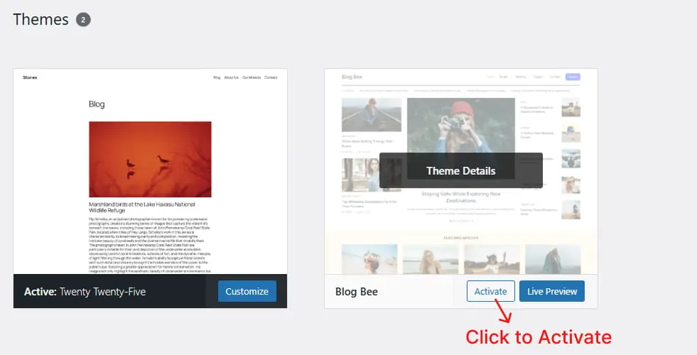
- Click on Appearance -> Themes -> Add New
- Search for “Blog Bee” in the search field.
- You can upload the theme zip file if you have downloaded before.
- Click on Install button and then Activate the theme.
Pro Version
Buy Blog Bee premium version from the blazethemes store you will get email once your purchase is completed. Download the theme zip from the link given in the email or download the latest version of the theme from “My Account” page
- Log in to your WordPress Administration Panel.
- Click on Appearance -> Themes -> Add New
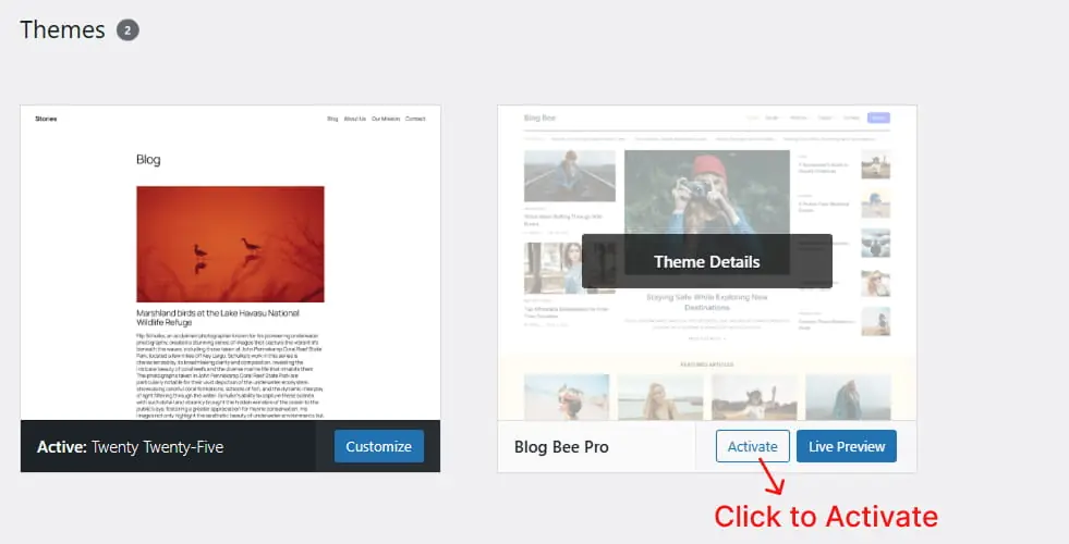
- Upload the theme zip file that you have downloaded.
- Click on Install button and then Activate the theme.
Download the latest version of the Blog Bee from https://wordpress.org/themes/blog-bee page.
- Unzip the downloaded zip file.
- Upload the unzipped file inside public_html/wp-content/themes/.
- Now, activate the theme through Dashboard > Appearance -> Themes
- Activate the Blog Bee and Click on “Customize” in the Appearance Menu in the Dashboard. Now you can customize or modify according to your choice.
Pro Version
Buy Blog Bee from the blazethemes store you will get email once your purchase is completed. Download the theme zip from the link given in the email or download the latest version of the theme from “My Account” page
- Unzip the downloaded zip file.
- Upload the unzipped file inside public_html/wp-content/themes/.
- Now, activate the theme through Dashboard > Appearance -> Themes
- Activate the Blog Bee and Click on “Customize” in the Appearance Menu in the Dashboard. Now you can customize or modify according to your choice.
3. License Integration
Pro Version
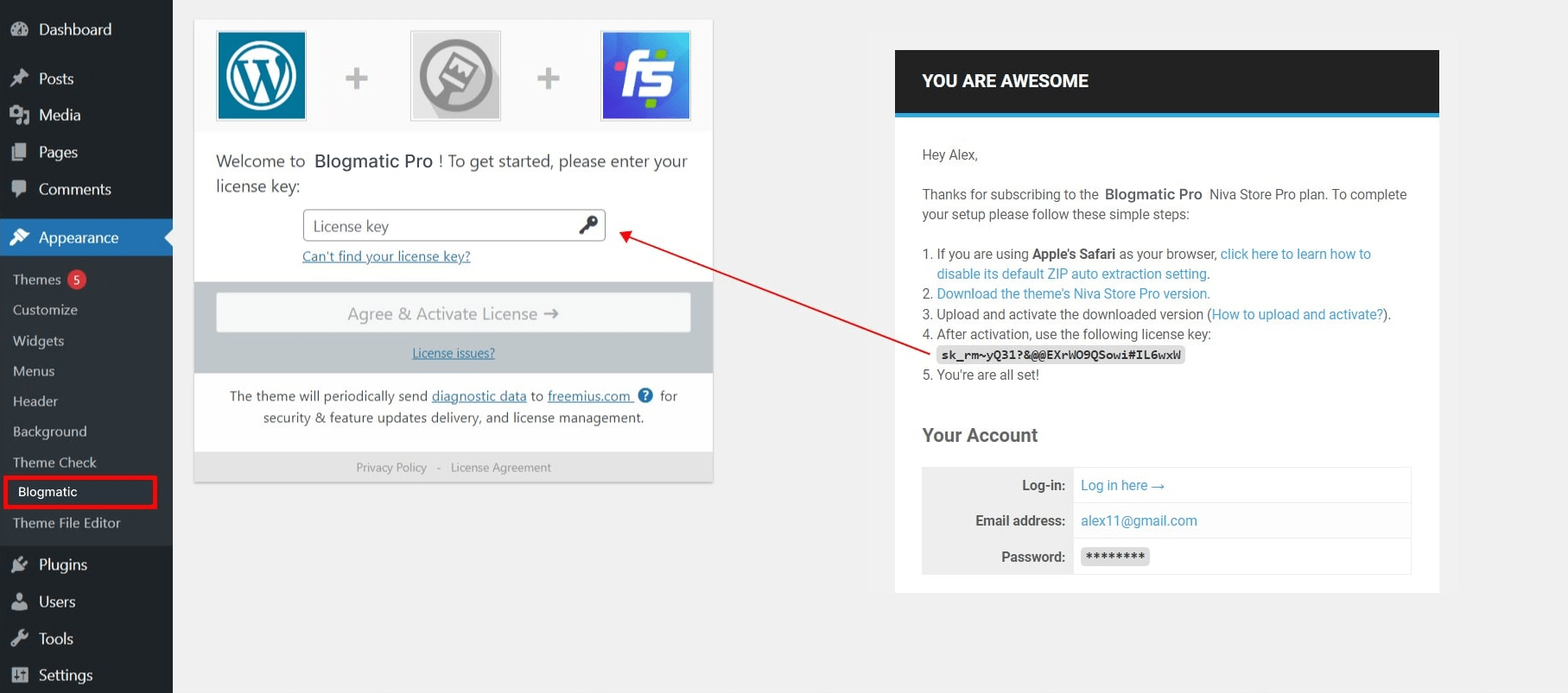
You need to activate the license key in order to receive Automatic Theme Updates which includes featured updates, security updates and bug fixes. To activate the license key,
- First you have to find the license key that you will get in your purchase confirmation email.
- You can also find your license key in “My Account” page of blazethemes.com
- Now, go through your dashboard > appearance > Blog Bee License
- Paste the license key in the input field and click “Activate License”
4. Pre-Built Websites
It is hard to mix all the right elements when you try to create the perfect site. So we have created some beautiful and flexible pre-built websites that make you easier. Pre-built websites are easy and quick to install in your WordPress. Our Pre-built websites were carefully tested so you don’t have to create your site everything from scratch. Just one click and you are good to start.
5. Demo Import
After you activate Blog Bee in your website. You can use demo import to make your site look like one of our available demos.
- Go to Appearance > Blog Bee Info
- You can see list of all demos in this page
- If you have not install/activate the Blazethemes Demo Importer plugin Click on install/activate demo importer button just above the demos listing section
6. Global Option
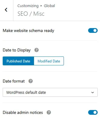
To work on SEO / Miscs
- Dashboard > Appearance > Customize > Global Option > SEO / Miscs
- Toggle to make website schema ready
- Choose published or modified date to show from dropdown
- Choose date format applied to single and archive pages from dropdown
- Toggle to enable / disable theme admin notices
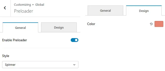
To work on Preloader
- Dashboard > Appearance > Customize > Global Option > Preloader
- Toggle to enable site preloader
- Choose preloader styles from dropdown
- Option to change the preloader color
Pro Version
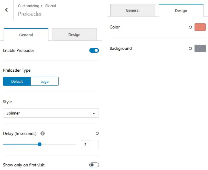
- Dashboard > Appearance > Customize > Global Option > Preloader
- Toggle to enable site preloader
- Choose preloader type
- Choose available preloader styles
- Set preloader delay
- Option to change preloader color and background color
To work on Block Title
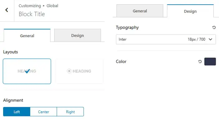
- Dashboard > Appearance > Customize > Global Option > Block Title
- Choose block title layout
- Set the alignment
- Set block title typography
- Option to change block title color
Pro Version
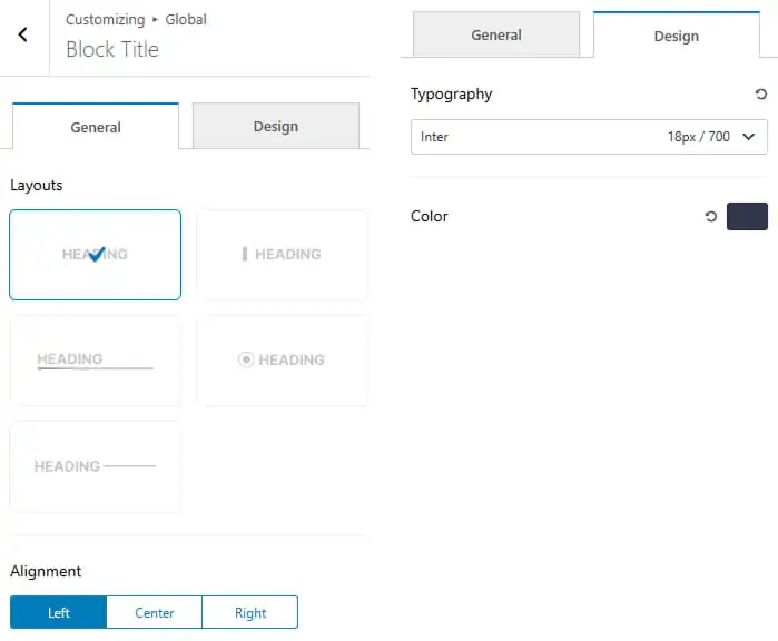
- Dashboard > Appearance > Customize > Global Option > Block Title
- Choose block title layout
- Set the alignment
- Set block title typography
- Option to change block title color
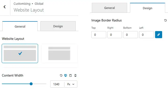
The layout of your website can define its success. Get the wrong design and people will be confused and destroying the user experience.
To work on Website Layout
- Dashboard > Appearance > Customize > Global Option > Website Layout
- Choose website layout to box-width or full width
- Set content width
- Set image border radius
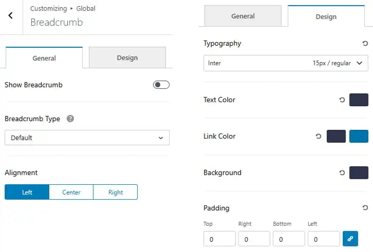
Breadcrumb is a secondary navigation aid that helps users easily understand the relation between their location on a page. It can show users how the page they are on is categorized on the site or the path the user took to find it.
To work on Breadcrumb Option
- Dashboard > Appearance > Customize > Global Option > Breadcrumb Option
- Toggle to show breadcrumb
- Choose breadcrumb type from dropdown after installing respective plugins
- Set the breadcrumb alignment to Left, Center, or Right. to Left, Center, or Right.
- Navigate to the Design tab to customize breadcrumb typography.
- Choose the text color for the breadcrumb.
- Set the link color for breadcrumb links, including hover color.
- Set the background color for the breadcrumb area.
- Adjust the padding for the breadcrumb.
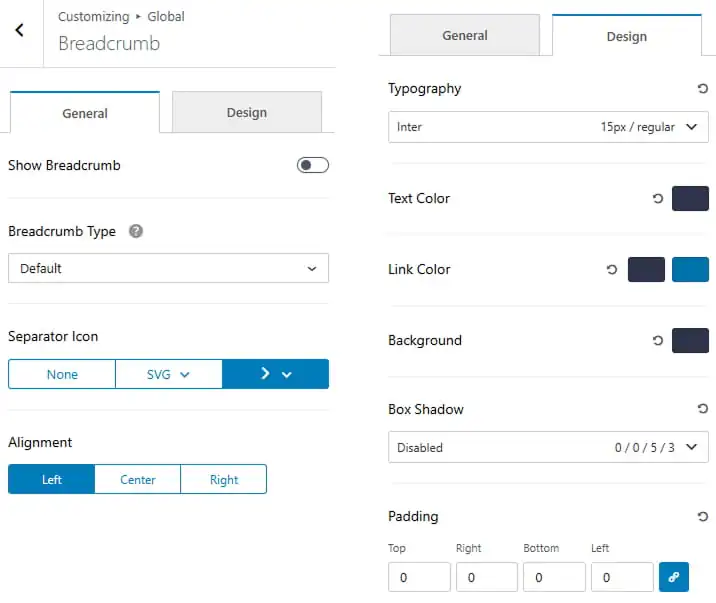
Pro Version
- Dashboard > Appearance > Customize > Global Option > Breadcrumb Option
- Toggle to show or hide the breadcrumb.
- Select the breadcrumb type from the dropdown.
- Choose a separator icon from the available options.
- Set the breadcrumb alignment to Left, Center, or Right.
- Navigate to the Design tab to customize the breadcrumb appearance.
- Set the typography including font family, size, and weight.
- Choose the text color for the breadcrumb.
- Set the link color and hover color for breadcrumb links.
- Set the background color for the breadcrumb.
- Configure the box shadow using the available options.
- Adjust the padding for the breadcrumb.
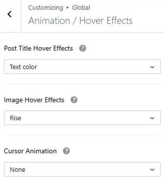
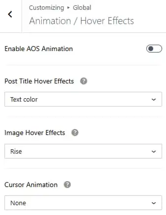
Animation / Hover Effects can personalize your site and create delightful experiences for your visitors. When a website visitor or user hovers over an animated element like a link or button for example, it can change color, grow, rotate and more. This is enjoyable for the visitor or user and shows that your site is working. We have provided five post title hover effects and five image hover effects in pro version and one each in free version.
To work on Animation / Hover Effects
- Dashboard > Appearance > Customize > Global Option > Animation / Hover Effects
- Choose a post title hover effect from the available options.
- Select an image hover effect such as Rise.
- Choose a cursor animation from the available options or disable it by selecting None.
Pro Version
- Dashboard > Appearance > Customize > Global Option > Animation / Hover Effects
- Toggle to enable AOS animation
- Choose a post title hover effect from the available options.
- Select an image hover effect such as Rise.
- Choose a cursor animation from the available options or disable it by selecting None.
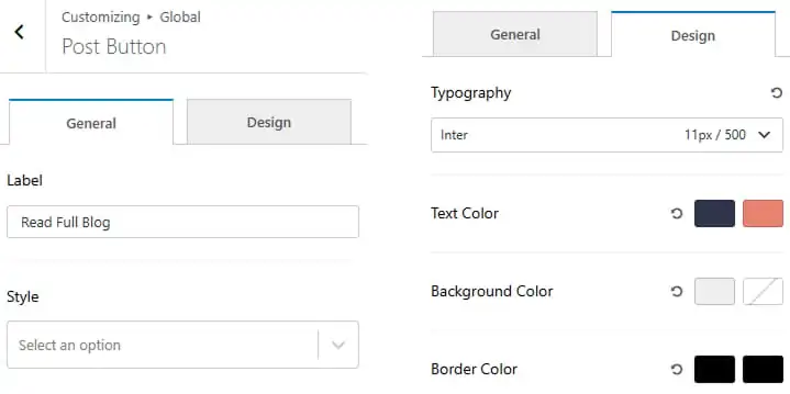
To work on Post Button
- Dashboard > Appearance > Customize > Global Option > Post Button
- Enter the button label to display on post cards.
- Select the button style from the dropdown.
- Navigate to the Design tab to customize the button appearance.
- Set the button typography.
- Choose the text color for the button and its hover state.
- Set the background color for the button and its hover state.
- Set the border color for the button and its hover state.
Pro Version
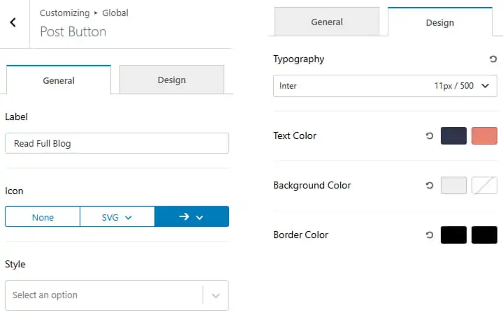
- Dashboard > Appearance > Customize > Global Option > Buttons
- Enter the button label to display on post cards.
- Choose an icon for the button from the available options.
- Select the button style from the dropdown.
- Navigate to the Design tab to customize the button appearance.
- Set the button typography.
- Choose the text color for the button and its hover state.
- Set the background color for the button and its hover state.
- Set the border color for the button and its hover state.
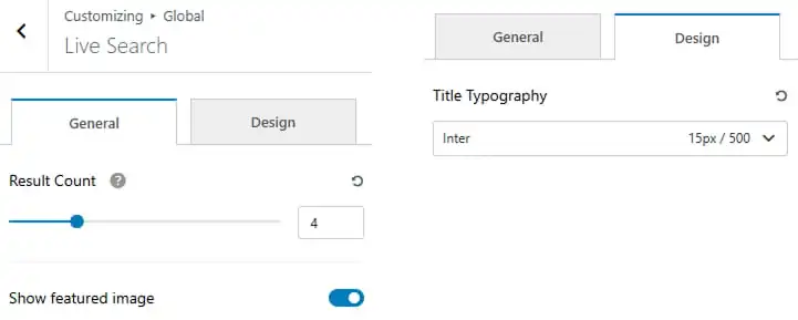
To work on Live Search
- Dashboard > Appearance > Customize > Global Option > Live Search
- Set result count
- Toggle to show featured image
- Navigate to the Design tab to customize the live search appearance.
- Set the live search typography.
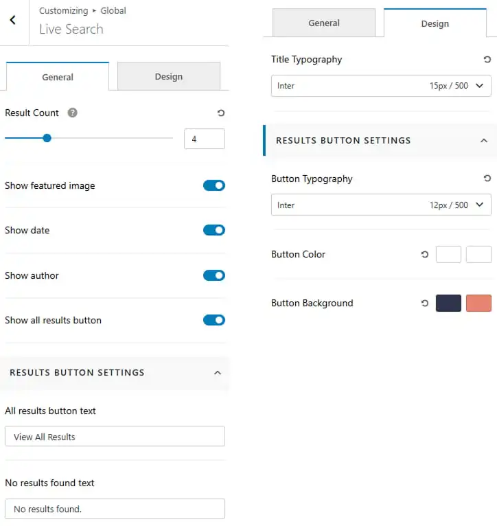
Pro Version
- Dashboard > Appearance > Customize > Global Option > Breadcrumb Option
- Set result count
- Toggle to show featured image, show date, show author and show all results button.
- Enter the all results button text and no results found test to display.
- Navigate to the Design tab to customize the live search appearance.
- Set the live search title typography.
- Set the button typography.
- Set the button color and hover color.
- Set the button background color and hover color.
To work on Sidebar Options
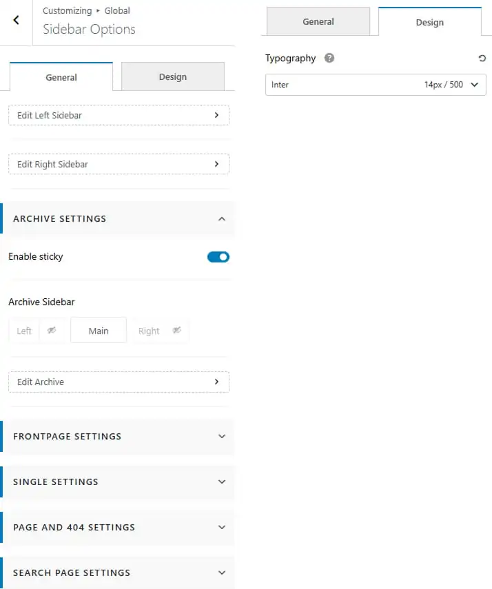
- Dashboard > Appearance > Customize > Global Option > Sidebar Options
- Toggle to enable sidebar sticky
- Show / hide left sidebar or right sidebar specific pages or sections.
- Reorder the layout columns by arranging the Left Sidebar, Main Content, and Right Sidebar according to your preference.
- Navigate to the Design tab to customize the sidebar appearance.
- Set the sidebar title typography.
Pro Version
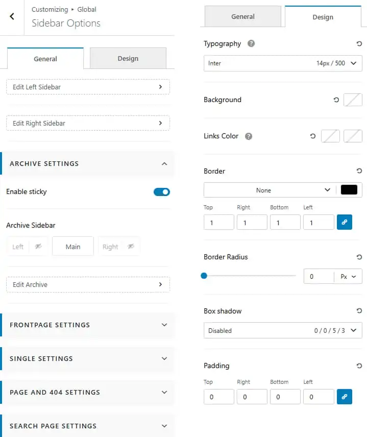
- Dashboard > Appearance > Customize > Global Option > Sidebar Options
- Toggle to enable sidebar sticky
- Show / hide left sidebar or right sidebar specific pages or sections.
- Reorder the layout columns by arranging the Left Sidebar, Main Content, and Right Sidebar according to your preference.
- Navigate to the Design tab to customize the sidebar appearance.
- Set the sidebar title typography.
- Set the background color for the sidebar.
- Set the link color and hover color.
- Set the sidebar border style, width and color.
- Set the sidebar border radius.
- Set the sidebar box-shadow.
- Customize the sidebar padding.
7. Colors
Color is such a fundamental part of the way we perceive the world. This is why one of the most powerful tools in a designer’s arsenal is color. It can either make or break a design; it can be the determining factor in engaging viewers or sending them promptly on their way.
Color Presets help you to get the variety of Shades of the selected Palette. You get the shades automatically for any new Color you modify in the Palette.
To work on Theme Colors / Preset
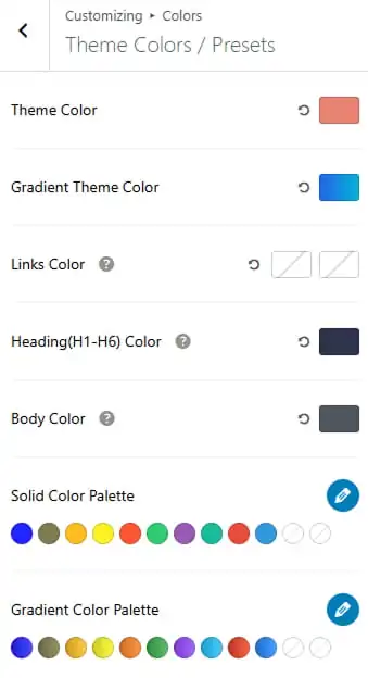
- Dashboard > Appearance > Customize > Colors > Theme Colors / Preset
- Set theme color and gradient theme color.
- Set link color and hover color.
- Set Heading ( H1 – H6 ) color.
- Set body color.
- Set solid and gradient color presets.
- Click to pencil icon to change the color presets palette.
To work on Category Colors
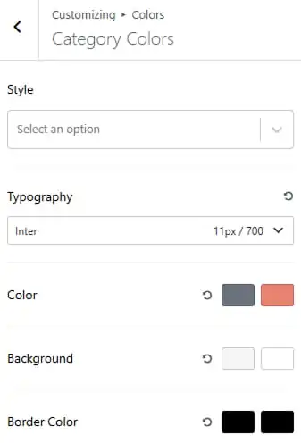
- Dashboard > Appearance > Customize > Colors > Category Colors
- Select the cateogry style from the dropdown.
- Set the typography including font family, size, and weight.
- Set category text color and hover color.
- Set category background color and hover color.
- Set category border color and hover color.
8. Card Settings
To work on Card Settings
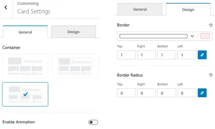
- Dashboard > Appearance > Customize > Card Settings.
- Choose the card container layout from the available options.
- Enable or disable card animation effects.
- Navigate to the Design tab to customize the card appearance.
- Customize the border style, width, and color.
- Adjust the border radius for each side of the card.
Pro Version
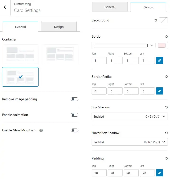
- Dashboard > Appearance > Customize > Card Settings.
- Choose the card container layout from the available options.
- Enable or disable image padding within the card.
- Enable or disable card animation effects.
- Enable or disable Glass Morphism for the card design.
- Navigate to the Design tab to customize the card appearance.
- Set the background color for the card.
- Customize the border style, width, and color.
- Adjust the border radius for each side of the card.
- Configure the box shadow for the card.
- Set the hover box shadow effect.
- Adjust the card padding for Top, Right, Bottom, and Left.
9. Typography & Icon Picker
Typography design serves many purposes, from making words legible to evoking emotion to creating a consistent brand identity. A brand logo that incorporates good typographic elements can result in consumers viewing the brand positively, and visually pleasing font pairings can make presentations more dynamic.
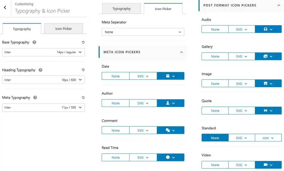
To work on Typography
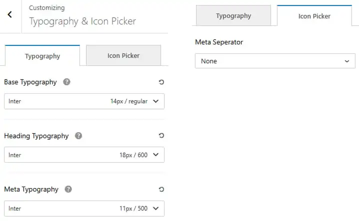
- Dashboard > Appearance > Customize > Typography & Icon Picker
- Set base typography, heading typography and meta typography.
- Navigate to the Design tab to customize the card appearance.
- Choose meta seperator from dropdown
Pro Version
- Dashboard > Appearance > Customize > Typography & Icon Picker
- Set base typography, heading typography and meta typography.
- Navigate to the Design tab to customize the card appearance.
- Choose meta seperator from dropdown
- Choose a meta icon from the available meta icon pickers.
- Choose a post format icon from the available post format icon pickers.
10. Advertisement
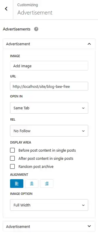
To work on Advertisement
- Dashboard > Appearance > Customize > Advertisement
- Click to dropdown arrow
- Upload advertisement image
- Place your URL
- Click to open in new tab or same tab
- Click to rel to no follow, no opener or no referrer
- Choose display area
- Choose image alignment and image option to original or full with
Pro Version
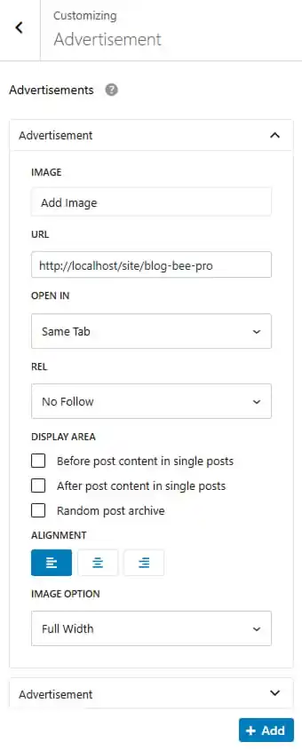
- Dashboard > Appearance > Customize > Advertisement
- Click to dropdown arrow
- Upload advertisement image
- Place your URL
- Click to open in new tab or same tab
- Click to rel to no follow, no opener or no referrer
- Choose display area
- Choose image alignment and image option to original or full with
- Click to add new advertisement
11. Insta Gallery
Pro Version
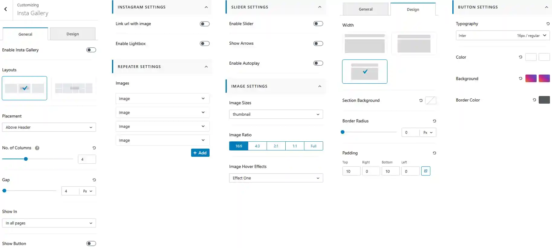
To work on Insta Gallery
- Dashboard > Appearance > Customize > Insta Gallery
- Enable or disable the Insta Gallery.
- Choose the gallery layout from the available options.
- Set the gallery placement.
- Set the number of columns for the gallery.
- Adjust the gap between gallery items.
- Choose where to display the Instagram Gallery.
- Enable or disable the gallery button.
Instagram Settings
- Enable or disable linking the image to Instagram.
- Enable or disable the Lightbox for gallery images.
- Select the image source for each gallery item.
- Click Add to add additional images.
Slider Settings
- Enable or disable the slider.
- Show or hide slider arrows.
- Enable or disable autoplay.
Image Settings
- Choose the image size from the available options.
- Select the image ratio such as 16:9, 4:3, 2:1, 1:1, or Full.
- Choose an image hover effect from the available options.
Design Settings
- Choose the gallery width/layout from the available options.
- Set the section background color.
- Adjust the border radius for the gallery.
- Set the padding for Top, Right, Bottom, and Left.
Button Settings
- Customize the button typography including font family, size, and weight.
- Set the button text color and hover color.
- Set the button background color and hover color.
- Set the button border color and hover color.
12. Header Builder
To work on Header Builder
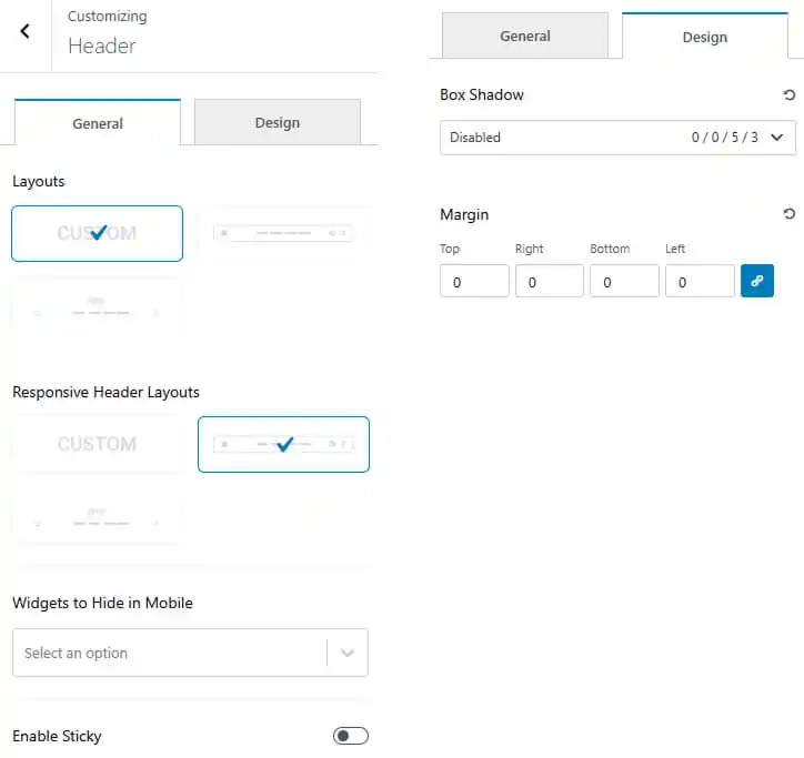
- Dashboard > Appearance > Customize > Header Builder
- Choose the header layouts from the available options.
- Choose the responsive header layouts from the available options.
- Choose widgets to hide in mobile.
- Toggle to enable sticky header.
- Navigate to the Design tab to customize the header appearance.
- Set the box shadow effect.
- Adjust the footer margin for Top, Right, Bottom, and Left.
Pro Version
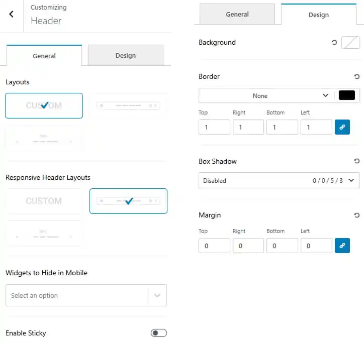
- Dashboard > Appearance > Customize > Header Builder
- Choose the header layouts from the available options.
- Choose the responsive header layouts from the available options.
- Choose widgets to hide in mobile.
- Toggle to enable sticky header.
- Navigate to the Design tab to customize the header appearance.
- Set the header background color.
- Customize the border style, width, and color.
- Set the box shadow effect.
- Adjust the footer margin for Top, Right, Bottom, and Left.
To work on Button
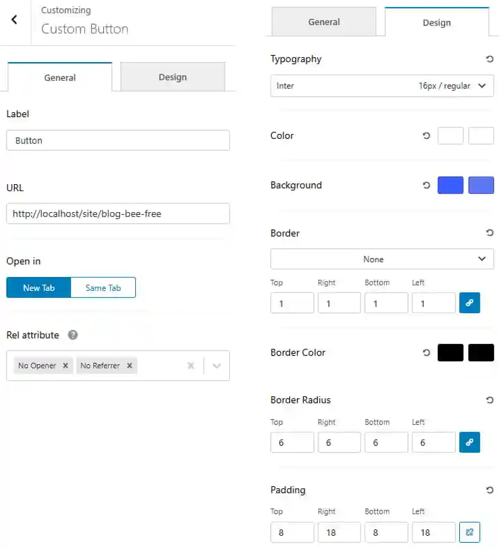
- Dashboard > Appearance > Customize > Header Builder > Button
- Enter a button label.
- Place your URL.
- Choose rel attribute from dropdown
- Navigate to the Design tab to customize the header appearance.
- Customize the button typography.
- Set the button color and hover color.
- Set the button background color and hover color.
- Customize the border style, width, and color.
- Adjust the border radius for each side of the button.
- Adjust the button padding for Top, Right, Bottom, and Left.
Pro Version
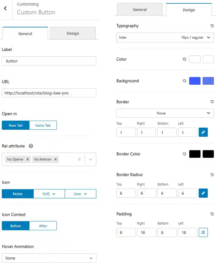
- Dashboard > Appearance > Customize > Header Builder > Button
- Enter a button label.
- Place your URL.
- Choose rel attribute from dropdown
- Select the button style from the dropdown.
- Select icon context.
- Choose button hover animation
- Navigate to the Design tab to customize the header appearance.
- Customize the button typography.
- Set the button color and hover color.
- Set the button background color and hover color.
- Customize the border style, width, and color.
- Adjust the border radius for each side of the button.
- Adjust the button padding for Top, Right, Bottom, and Left.
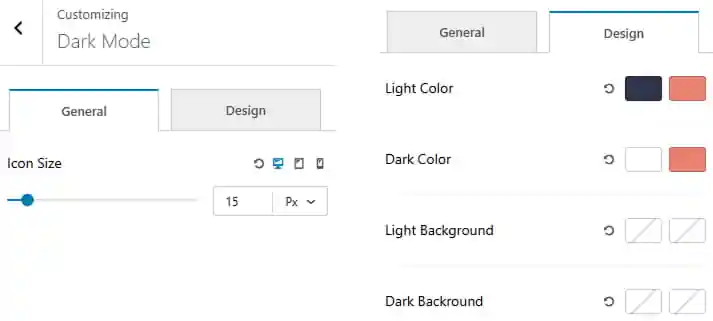
To work on Dark Mode
- Dashboard > Appearance > Customize > Header Builder > Dark Mode
- Set icon size.
- Navigate to the Design tab to customize the dark mode appearance.
- Choose the light icon color and its hover state.
- Choose the dark icon color and its hover state.
- Set the background color for the light and its hover state.
- Set the background color for the dark and its hover state.
Pro Version
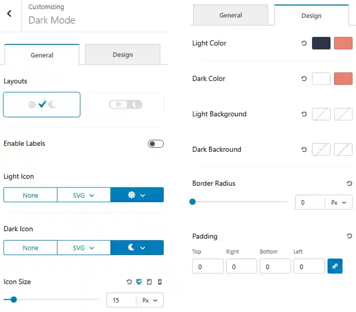
- Dashboard > Appearance > Customize > Header Builder > Dark Mode
- Choose the dark mode layout.
- Toggle to enable labels.
- Choose an icon for the light icon and dark icon from the available options.
- Set icon size.
- Navigate to the Design tab to customize the dark mode appearance.
- Choose the light icon color and its hover state.
- Choose the dark icon color and its hover state.
- Set the background color for the light and its hover state.
- Set the background color for the dark and its hover state.
- Adjust the border radius.
- Adjust the padding using Top, Right, Bottom, and Left values.
To work on Date Time
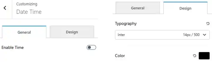
- Dashboard > Appearance > Customize > Header Builder > Date Time
- Toggle to enable time.
- Navigate to the Design tab to customize the dark mode appearance.
- Set the typography including font family, size, and weight.
- Choose the date time color and its hover state.
Pro Version
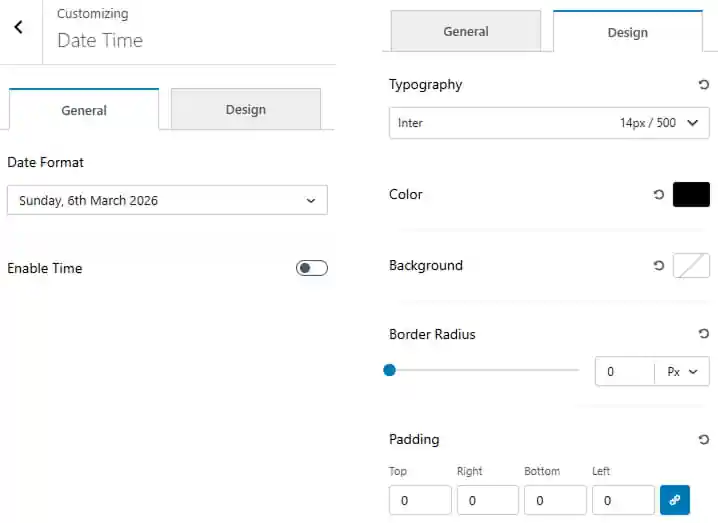
- Dashboard > Appearance > Customize > Header Builder > Date Time
- Choose date format from dropdown.
- Toggle to enable time.
- Navigate to the Design tab to customize the dark mode appearance.
- Set the typography including font family, size, and weight.
- Choose the date time color and its hover state.
- Set the date time background color.
- Adjust the border radius.
- Adjust the padding using Top, Right, Bottom, and Left values.
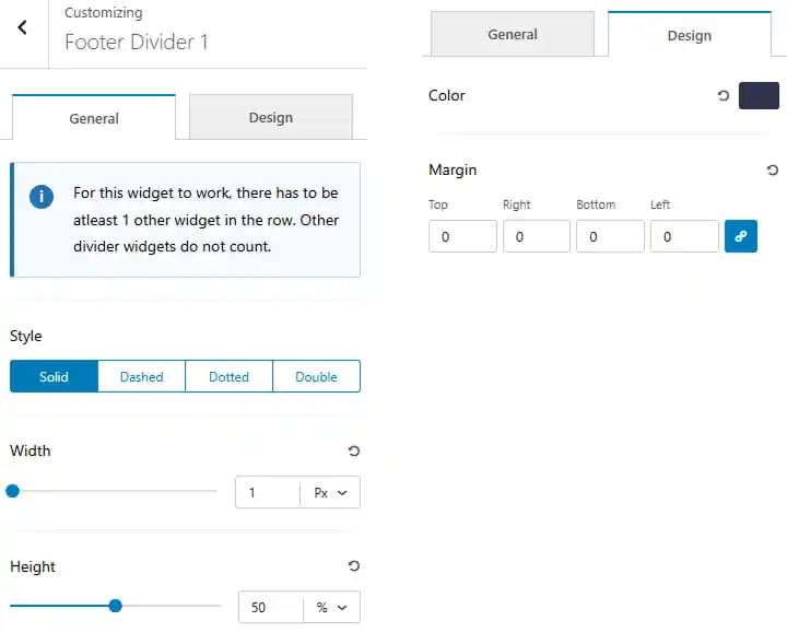
To work on Divider
There are three Divider to work with.
- Dashboard > Appearance > Customize > Header Builder > Divider
- Choose divider style.
- Set width and height of the divider.
- Navigate to the Design tab to customize the divider appearance.
- Set the divider color.
- Adjust the margin for Top, Right, Bottom, and Left.
To work on HTML
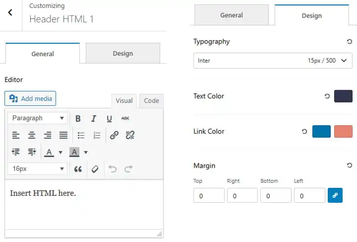
There are two HTML to work with.
- Dashboard > Appearance > Customize > Header Builder > HTML
- Choose the copyright text color.
- Inset the html.
- Navigate to the Design tab to customize the HTML appearance.
- Set the typography including font family, size, and weight.
- Choose the text color and its hover state.
- Choose the link color and its hover state.
- Adjust the margin for Top, Right, Bottom, and Left.
To work on Image
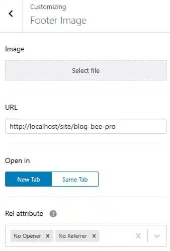
- Dashboard > Appearance > Customize > Header Builder > Image
- Upload an image
- Place your URL
- Click to open in new tab or same tab
- Choose rel attribute from dropdown
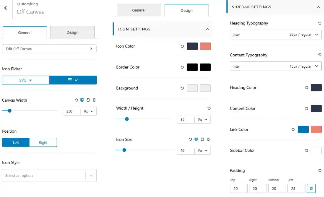
To work on Off Canvas
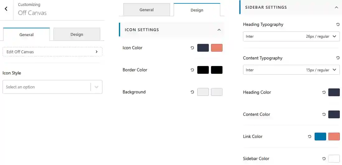
- Dashboard > Appearance > Customize > Header Builder > Off Canvas
- Choose the icon style from the available options.
Design Tab
Icon Settings
- Set the icon color and hover color.
- Set the icon border color and hover color.
- Set the icon background and hover background.
Sidebar Settings
- Customize the heading and content typography including font family, size, and weight.
- Set the heading and content color for the Off Canvas sidebar.
- Set the link color and hover color.
- Set the sidebar color for the sidebar elements.
Pro Version
- Dashboard > Appearance > Customize > Header Builder > Off Canvas
- Choose an icon for the Off Canvas toggle.
- Set the canvas width according to your preference.
- Set the Off Canvas position to Left or Right.
- Choose the icon style from the available options.
Design Tab
Icon Settings
- Set the icon color and hover color.
- Set the icon border color and hover color.
- Set the icon background and hover background.
- Adjust the icon width and height.
- Set the icon size according to your preference.
Sidebar Settings
- Customize the heading and content typography including font family, size, and weight.
- Set the heading and content color for the Off Canvas sidebar.
- Set the link color and hover color.
- Set the sidebar color for the sidebar elements.
- Adjust the sidebar padding for Top, Right, Bottom, and Left.
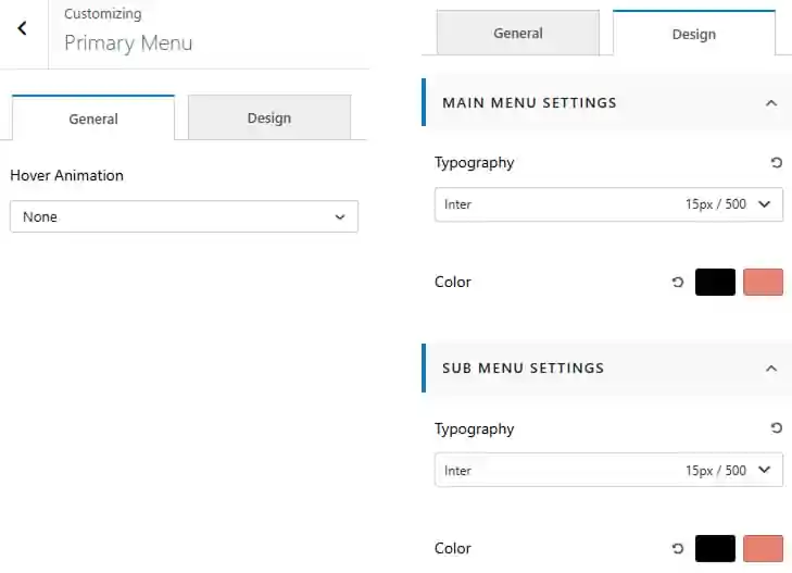
To work on Primary Menu
- Dashboard > Appearance > Customize > Header Builder > Primary Menu
- Choose the hover animation for the primary menu items.
Design Tab
Main Menu Settings
- Customize the menu typography including font family, size, and weight.
- Set the menu text color and hover color.
- Set the active menu item color.
Sub Menu Settings
- Customize the submenu typography including font family, size, and weight.
- Set the submenu text color and hover color.
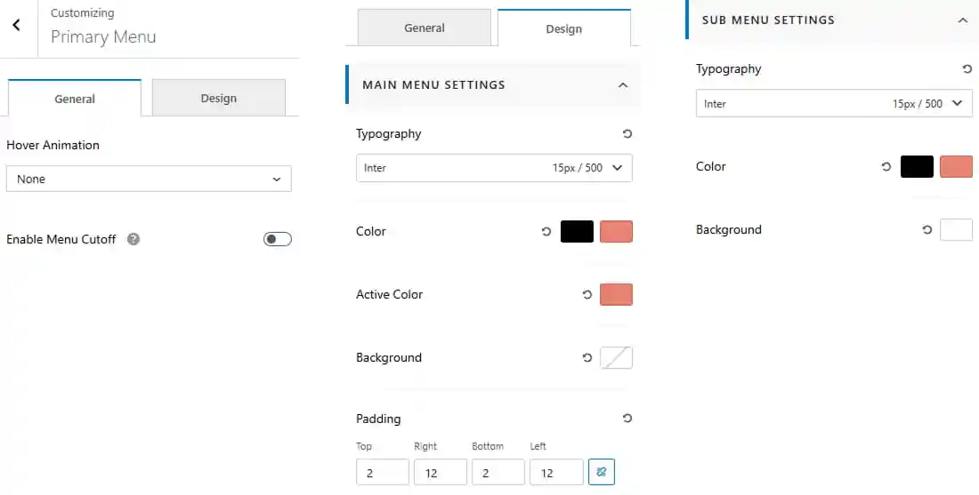
Pro Version
- Dashboard > Appearance > Customize > Header Builder > Primary Menu
- Choose the hover animation for the primary menu items.
- Enable or disable the menu cutoff option.
Design Tab
Main Menu Settings
- Customize the menu typography including font family, size, and weight.
- Set the menu text color and hover color.
- Set the active menu item color.
- Set the menu background color.
- Adjust the menu padding for Top, Right, Bottom, and Left.
Sub Menu Settings
- Customize the submenu typography including font family, size, and weight.
- Set the submenu text color and hover color.
- Set the submenu background color.
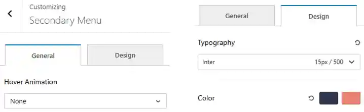
To work on Secondary Menu
- Dashboard > Appearance > Customize > Header Builder > Secondary Menu
- Choose the hover animation for the secondary menu items.
- Customize the menu typography including font family, size, and weight.
- Set the menu text color and hover color.
Pro Version
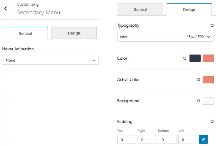
- Dashboard > Appearance > Customize > Header Builder > Secondary Menu
- Choose the hover animation for the secondary menu items.
- Customize the menu typography including font family, size, and weight.
- Set the menu text color and hover color.
- Set the active menu item color.
- Set the menu background color.
- Adjust the menu padding for Top, Right, Bottom, and Left.
Pro Version
To work on Random Blog
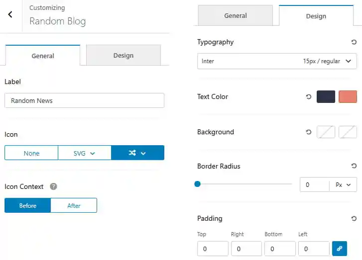
- Dashboard > Appearance > Customize > Header Builder > Random Blog
- Enter a label for the Random Blog.
- Choose an icon from the available options.
- Set the icon context to display the icon Before or After the label.
- Navigate to the Design tab to customize the appearance.
- Set the typography including font family, size, and weight.
- Set the text color and hover color.
- Set the background color and hover color.
- Adjust the border radius of the Random Blog element.
- Adjust the padding for Top, Right, Bottom, and Left.
Pro Version
To work on Search Field
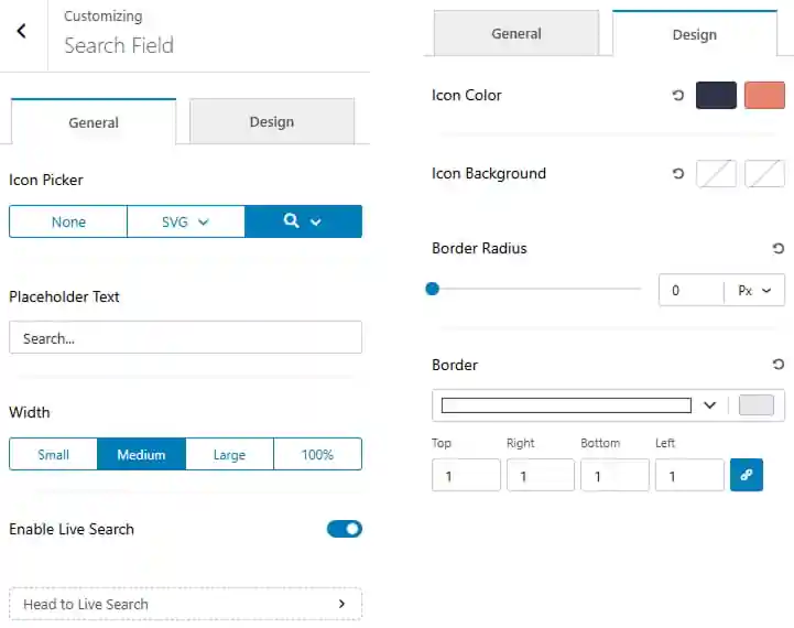
- Dashboard > Appearance > Customize > Footer Builder > Search Field
- Choose an icon for the search field from the available options.
- Set the placeholder text displayed inside the search field.
- Choose the search field width from Small, Medium, Large, or 100%.
- Enable or disable the Live Search feature.
- Navigate to the Design tab to customize the search field appearance.
- Set the icon color and hover color.
- Set the icon background and hover background.
- Adjust the border radius of the search field.
- Customize the border style, width, and color.
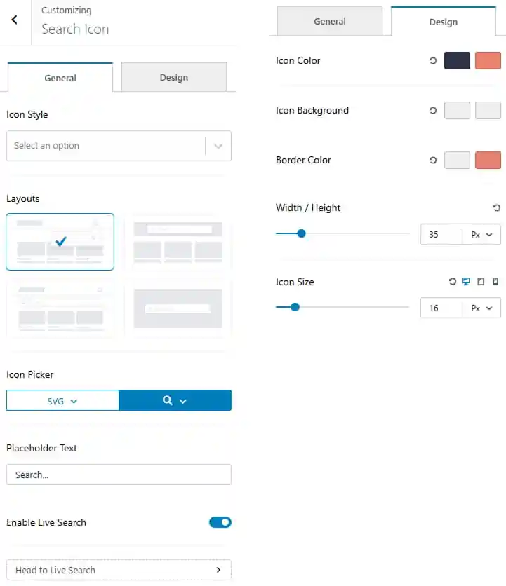
To work on Search
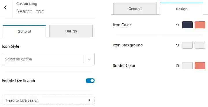
- Dashboard > Appearance > Customize > Header Builder > Search
- Choose the icon style from the available options.
- Enable or disable Live Search.
- Navigate to the Design tab to customize the search icon appearance.
- Set the icon color and hover color.
- Set the icon background and hover background.
- Set the border color and hover color.
Pro Version
- Dashboard > Appearance > Customize > Header Builder > Search
- Choose the icon style from the available options.
- Select the search layout from the available layouts.
- Choose an icon from the Icon Picker.
- Set the placeholder text displayed in the search field.
- Enable or disable Live Search.
- Navigate to the Design tab to customize the search icon appearance.
- Set the icon color and hover color.
- Set the icon background and hover background.
- Set the border color and hover color.
- Adjust the icon width and height.
- Adjust the icon size according to your preference.
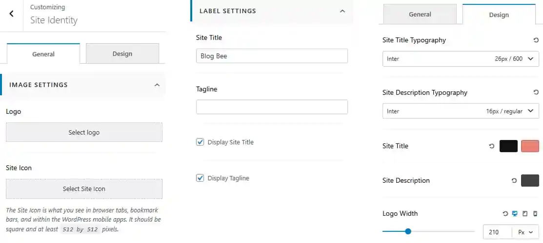
To work on Site Identity
- Dashboard > Appearance > Customize > Header Builder > Site Identity
- Upload or select a logo for the website.
- Upload or select a site icon for the website.
- Enter the site title and tagline.
- Enable or disable the display of the site title and tagline.
- Navigate to the Design tab to customize the site identity appearance.
- Set the site title typography including font family, size, and weight.
- Set the site description typography including font family, size, and weight.
- Set the site title color and hover color.
- Set the site description color.
- Adjust the logo width according to your preference.
Pro Version
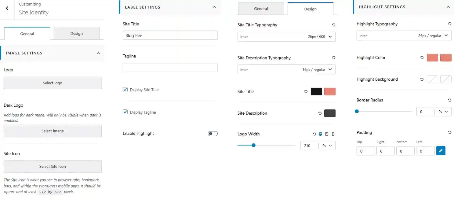
- Dashboard > Appearance > Customize > Header Builder > Site Identity
- Upload or select a logo for the website.
- Upload or select a dark logo for use on dark backgrounds.
- Upload or select a site icon for the website.
- Enter the site title and tagline.
- Enable or disable the display of the site title and tagline.
- Enable or disable the highlight for the site identity.
- Navigate to the Design tab to customize the site identity appearance.
- Set the site title typography including font family, size, and weight.
- Set the site description typography including font family, size, and weight.
- Set the site title color and hover color.
- Set the site description color.
- Adjust the logo width according to your preference.
- Customize the highlight typography including font family, size, and weight.
- Set the highlight color and hover color.
- Set the highlight background color.
- Adjust the border radius of the highlight.
- Adjust the padding for Top, Right, Bottom, and Left.
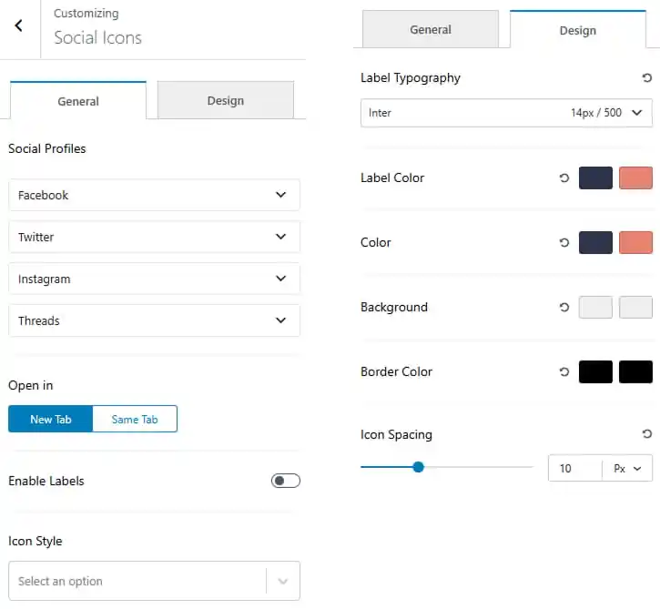
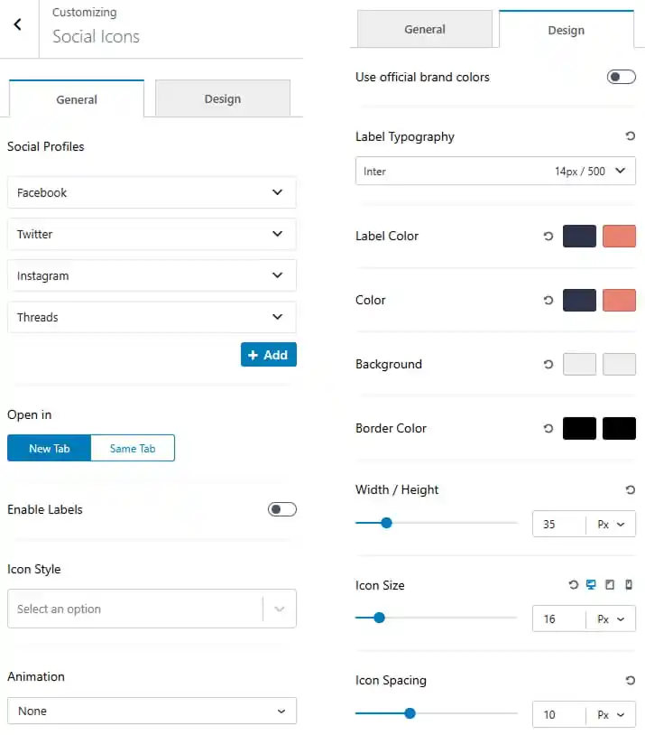
To work on Social Icons
- Dashboard > Appearance > Customize > Header Builder > Social Icons
- Choose social icon to show from dropdown.
- Click to open in new tab or same tab.
- Toggle to enable labels.
- Select the icon style from the dropdown.
- Navigate to the Design tab to customize the button appearance.
- Set the typography including font family, size, and weight.
- Choose the label color and its hover state.
- Choose the icon color and its hover state.
- Choose the icon background color and its hover state.
- Choose the icon border color and its hover state.
- Set icon spacing.
Pro Version
- Dashboard > Appearance > Customize > Header Builder > Social Icons
- Choose social icon to show from dropdown.
- Click to add new social icon.
- Click to open in new tab or same tab.
- Toggle to enable labels.
- Select the icon style from the dropdown.
- Select icon animation from dropdown.
- Navigate to the Design tab to customize the button appearance.
- Toggle to use official brand colors.
- Set the typography including font family, size, and weight.
- Choose the label color and its hover state.
- Choose the icon color and its hover state.
- Choose the icon background color and its hover state.
- Choose the icon border color and its hover state.
- Set icon width / height.
- Customize icon size.
- Set icon spacing.
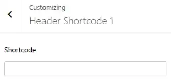
To work on Shortcode
There are two Shortcode to work with.
- Dashboard > Appearance > Customize > Header Builder > Shortcode
- Enter a shortcode.
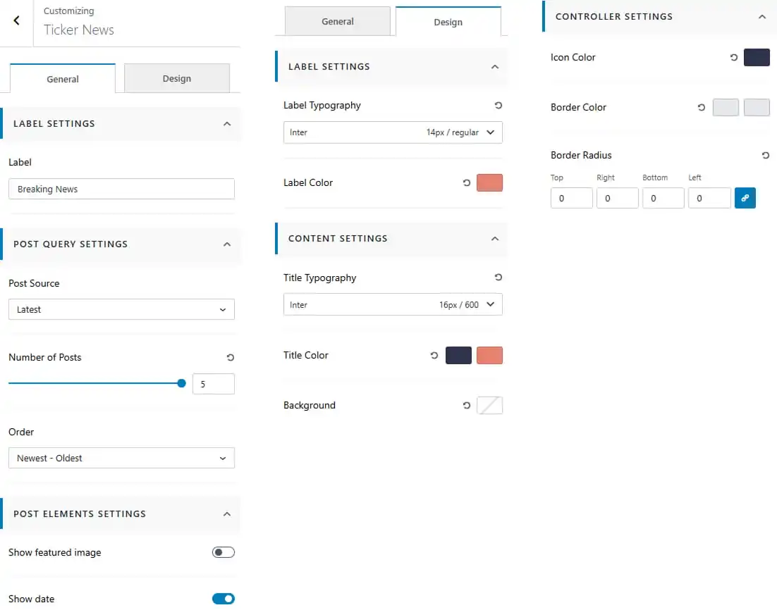
To work on Ticker News
- Dashboard > Appearance > Customize > Header Builder > Ticker News
- Enter a label for the ticker news section.
- Select the post source to determine which posts are displayed.
- Set the number of posts to display.
- Choose the post order for the ticker news.
- Show or hide the featured image and post date for ticker posts.
Design Tab
Label Settings
- Customize the label typography including font family, size, and weight.
- Set the label color.
Content Settings
- Customize the title typography including font family, size, and weight.
- Set the title color and hover color.
- Set the content background color.
Controller Settings
- Set the icon color.
- Set the controller border color and hover color.
- Adjust the controller border radius for each side.
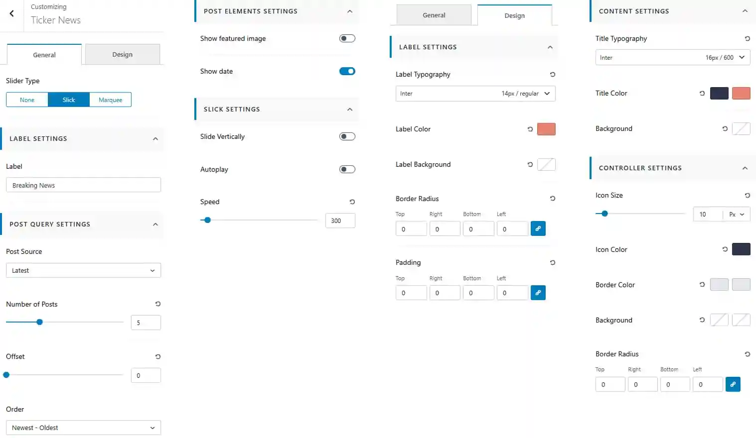
Pro Version
- Dashboard > Appearance > Customize > Heade Builder > Ticker News
- Choose the slider type as None, Slick, or Marquee.
- Enter a label for the ticker news section.
- Select the post source to determine which posts are displayed.
- Set the number of posts to display.
- Set the post offset to skip a specific number of posts.
- Choose the post order for the ticker news.
- Show or hide the featured image and post date for ticker posts.
Slick Settings
- Enable or disable vertical sliding for the ticker.
- Enable or disable autoplay.
- Adjust the slider speed according to your preference.
Design Tab
Label Settings
- Customize the label typography including font family, size, and weight.
- Set the label color.
- Set the label background color.
- Adjust the label border radius for each side.
- Adjust the label padding for Top, Right, Bottom, and Left.
Content Settings
- Customize the title typography including font family, size, and weight.
- Set the title color and hover color.
- Set the content background color.
Controller Settings
- Adjust the controller icon size.
- Set the icon color.
- Set the controller border color.
- Set the controller background color.
- Adjust the controller border radius for each side.
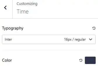
To work on Time
- Dashboard > Appearance > Customize > Header Builder > Time
- Customize the time typography including font family, size, and weight.
- Set the time color
Pro Version
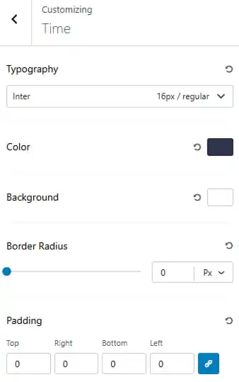
- Dashboard > Appearance > Customize > Header Builder > Time
- Customize the time typography including font family, size, and weight.
- Set the time color
- Set the time background color.
- Adjust the border radius.
- Adjust the time padding for Top, Right, Bottom, and Left.
To work on Widgets
There are two widget areas to work with.
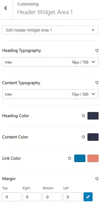
- Dashboard > Appearance > Customize > Header Builder > Widgets
- Set the heading and content typography including font family, size, and weight.
- Choose the heading and content color.
- Choose the link color and its hover state.
- Adjust the widget margin for Top, Right, Bottom, and Left.
13. Frontpage Sections
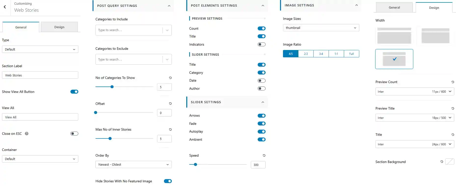
To work on Web Stories
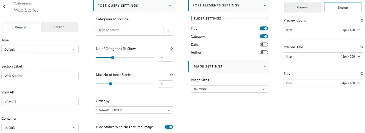
- Dashboard > Appearance > Customize > Frontpage Sections > Web Stories
- Select the Web Stories type from the available options.
- Enter a section label for the Web Stories section.
- Enter the View All button label.
- Choose the container layout for the section.
Post Query Settings
- Select categories to include in the Web Stories.
- Set the number of categories to display.
- Set the maximum number of inner stories to display.
- Choose the post order for the Web Stories.
- Show or hide stories without a featured image.
Post Elements Settings
- Show or hide the slider title, category, date and author.
Image Settings
- Choose the image size from the available options.
Design Tab
- Customize the preview count typography.
- Customize the preview title typography.
- Customize the story title typography.
Pro Version
- Dashboard > Appearance > Customize > Frontpage Sections > Web Stories
- Select the Web Stories type from the available options.
- Enter a section label for the Web Stories section.
- Enter the View All button label.
- Enable or disable closing the Web Stories section on ESC.
- Choose the container layout for the section.
Post Query Settings
- Select categories to include in the Web Stories.
- Select categories to exclude from the Web Stories.
- Set the number of categories to display.
- Set the post offset to skip a specific number of stories.
- Set the maximum number of inner stories to display.
- Choose the post order for the Web Stories.
- Show or hide stories without a featured image.
Post Elements Settings
- Show or hide the preview category count, title and indicators.
- Show or hide the title, category, date, and author in slider settings.
Slider Settings
- Show or hide slider arrows.
- Enable or disable the fade effect.
- Enable or disable autoplay.
- Enable or disable the ambient effect.
- Adjust the slider speed according to your preference.
Image Settings
- Choose the image size from the available options.
- Select the image ratio for the Web Stories.
Design Tab
- Choose the Web Stories width/layout from the available options.
- Customize the preview count typography.
- Customize the preview title typography.
- Customize the story title typography.
- Set the section background for the Web Stories section.
To work on Main Banner
- Dashboard > Appearance > Customize > Frontpage Sections > Main Banner
- Reorder the main banner layout using the Left, Main, and Right controls.
- Click to eye icon to show / hide sidebars.
- Edit the left sidebar and right sidebar from the available options.
- Choose the main banner layout from the available layouts.
- Set the content alignment to Left, Center, or Right.
- Choose the container layout for the main banner.
Post Query Settings
- Select the post source to determine which posts are displayed.
- Set the number of posts to display.
- Choose the post order for the banner posts.
- Show or hide posts without a featured image.
Post Elements Settings
- Reorder the post elements according to your preference.
- Show or hide and re-order individual post elements.
- Show or hide and re-order the meta elements.
Image Settings
- Choose the image size from the available options.
Design Tab
- Customize the post title typography including font family, size, and weight.
- Set the section background color.
Pro Version
- Dashboard > Appearance > Customize > Frontpage Sections > Main Banner
- Reorder the main banner layout using the Left, Main, and Right controls.
- Click to eye icon to show / hide sidebars.
- Edit the left sidebar and right sidebar from the available options.
- Choose the main banner layout from the available layouts.
- Set the content alignment to Left, Center, or Right.
- Choose the container layout for the main banner.
Post Query Settings
- Select the post source to determine which posts are displayed.
- Set the number of posts to display.
- Set the post offset to skip a specific number of posts.
- Choose the post order for the banner posts.
- Show or hide posts without a featured image.
Post Elements Settings
- Reorder the post elements according to your preference.
- Show or hide and re-order individual post elements.
- Show or hide and re-order the meta elements.
- Set the excerpt length for banner posts.
Slider Settings
- Show or hide slider arrows.
- Enable or disable the fade effect.
- Enable or disable autoplay.
- Show or hide slider dots.
- Choose the slide direction as Vertical or Horizontal.
- Adjust the slider speed according to your preference.
Image Settings
- Choose the image size from the available options.
- Select the image ratio such as 6:9, 4:3, 2:1, 1:1, or Full.
Design Tab
- Choose the banner width/layout from the available options.
- Customize the post title typography including font family, size, and weight.
- Set the section background color.
- Adjust the gap between banner elements.
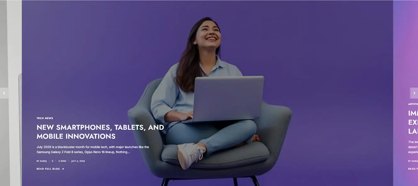
1. Main banner Layout One
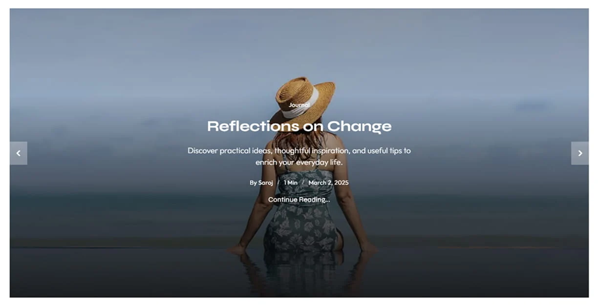 2. Main banner Layout Two ( with both sidebar )
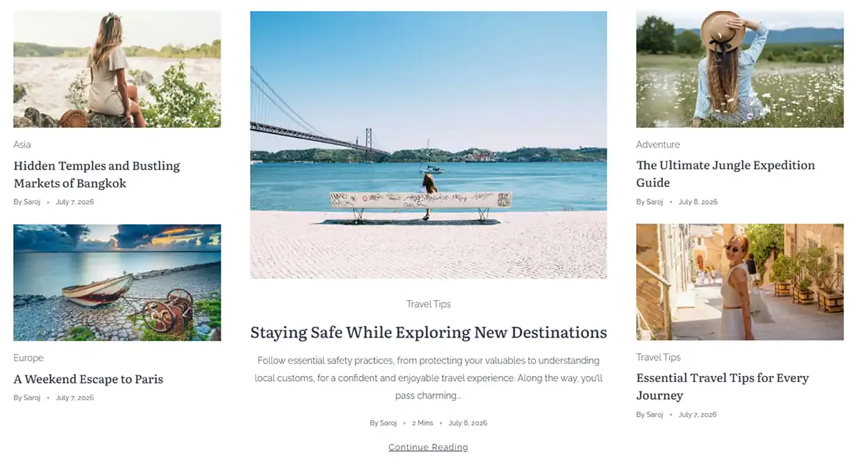
3. Main banner Layout Three
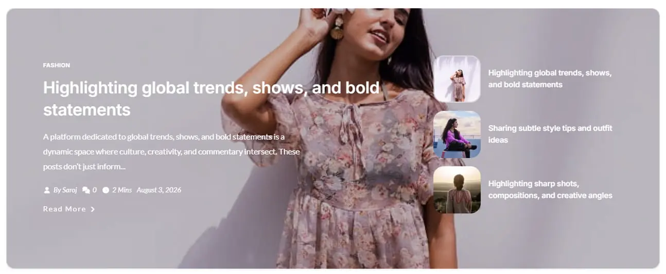
4. Main banner Layout Four
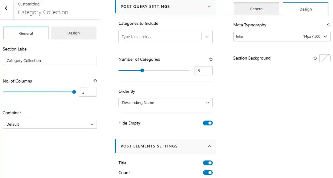
To work on Category Collection
- Dashboard > Appearance > Customize > Frontpage Sections > Category Collection
- Enter a section label for the Category Collection.
- Set the number of columns for the category layout.
- Choose the container layout for the section.
Post Query Settings
- Select the categories to include in the collection.
- Set the number of categories to display.
- Choose the category order from the available options.
- Show or hide empty categories.
Post Elements Settings
- Show or hide the category title.
- Show or hide the category count.
Design Settings
- Customize the meta typography including font family, size, and weight.
- Set the section background color.
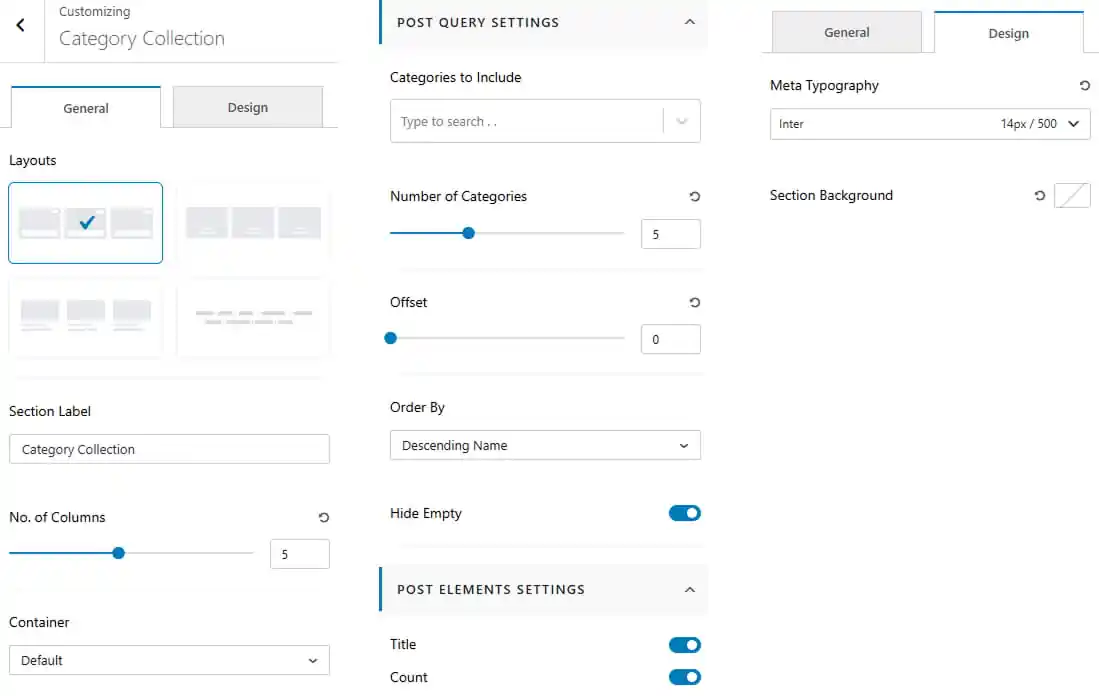
Pro Version
- Dashboard > Appearance > Customize > Frontpage Sections > Category Collection
- Choose the category collection layout from the available options.
- Enter a section label for the Category Collection.
- Set the number of columns for the category layout.
- Choose the container layout for the section.
Post Query Settings
- Select the categories to include in the collection.
- Set the number of categories to display.
- Set the offset to skip a specific number of categories.
- Choose the category order from the available options.
- Show or hide empty categories.
Post Elements Settings
- Show or hide the category title.
- Show or hide the category count.
Design Settings
- Customize the meta typography including font family, size, and weight.
- Set the section background color.
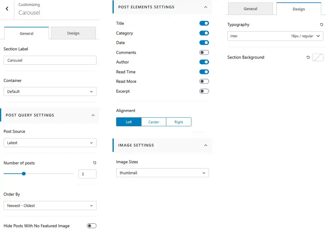
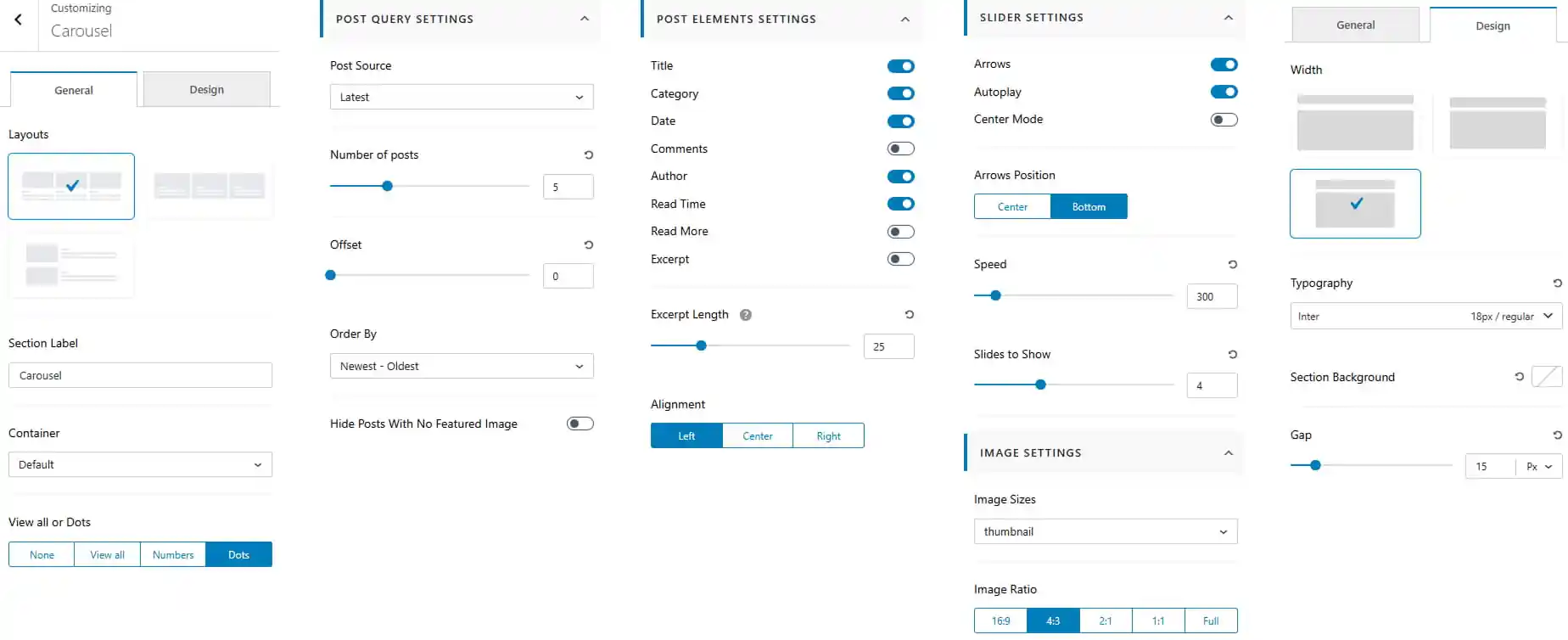
To work on Carousel
- Dashboard > Appearance > Customize > Frontpage Sections > Carousel
- Enter a section label for the carousel.
- Choose the container layout for the section.
Post Query Settings
- Select the post source to determine which posts are displayed.
- Set the number of posts to display.
- Choose the post order for the displayed posts.
- Show or hide posts without a featured image.
Post Elements Settings
- Show or hide individual post elements
- Set the post content alignment to Left, Center, or Right.
Image Settings
- Choose the image size from the available options.
Design Settings
- Customize the carousel typography including font family, size, and weight.
- Set the section background color.
Pro Version
- Dashboard > Appearance > Customize > Frontpage Sections > Carousel
- Choose the carousel layout from the available options.
- Enter a section label for the carousel.
- Choose the container layout for the section.
- Choose the pagination type as None, View All, Numbers, or Dots.
Post Query Settings
- Select the post source to determine which posts are displayed.
- Set the number of posts to display.
- Set the post offset to skip a specific number of posts.
- Choose the post order for the displayed posts.
- Show or hide posts without a featured image.
Post Elements Settings
- Show or hide individual post elements
- Set the excerpt length for carousel posts.
- Set the post content alignment to Left, Center, or Right.
Slider Settings
- Show or hide slider arrows.
- Enable or disable autoplay.
- Enable or disable Center Mode.
- Set the arrow position to Center or Bottom.
- Adjust the slider speed.
- Set the number of slides to show.
Image Settings
- Choose the image size from the available options.
- Select the image ratio such as 16:9, 4:3, 2:1, 1:1, or Full.
Design Settings
- Choose the carousel width/layout from the available options.
- Customize the carousel typography including font family, size, and weight.
- Set the section background color.
- Adjust the gap between carousel items.
Pro Version
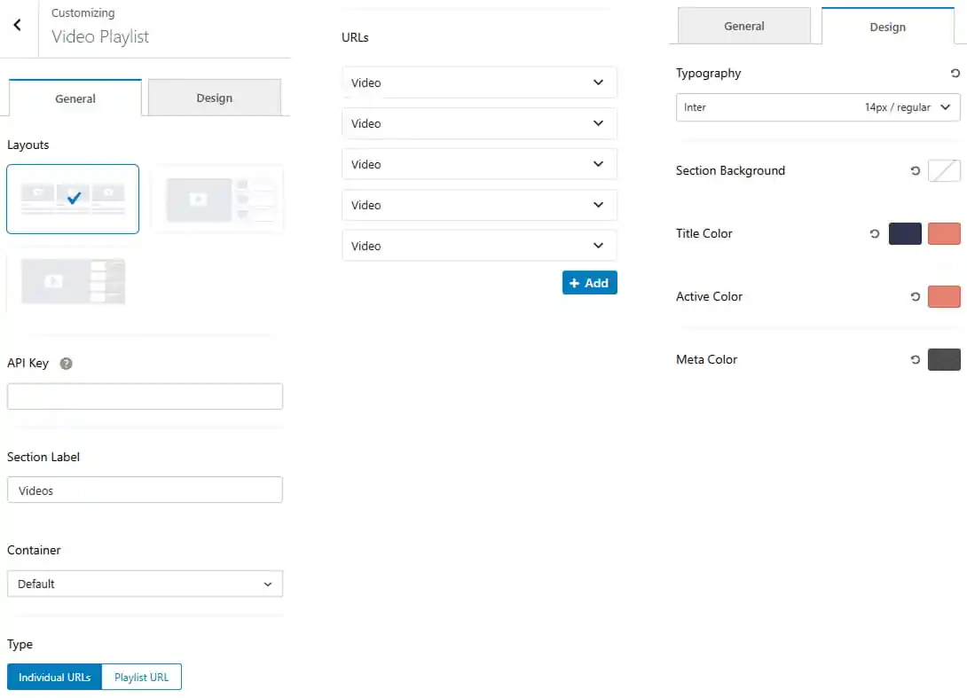
To work on Video Playlist
- Dashboard > Appearance > Customize > Frontpage Sections > Video Playlist
- Choose the video playlist layout from the available options.
- Enter theAPI Key required to fetch video content.
- Enter a section label for the Video Playlist section.
- Choose the container layout for the section.
- Select the video source type as Individual URLs or Playlist URL.
- Add video URLs to the playlist when using Individual URLs.
- Click Add to add additional video URLs.
- Customize the section typography including font family, size, and weight.
- Set the section background color.
- Set the title color and hover color.
- Set the active item color.
- Set the meta color for video metadata.
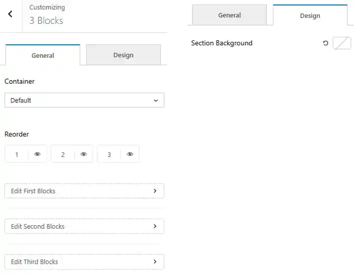
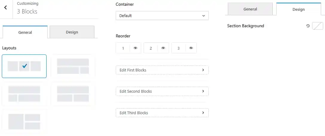
To work on 3 Blocks
- Dashboard > Appearance > Customize > Frontpage Sections > 3 Blocks
- Choose the container layout for the section.
- Show / hide and re-order the three blocks according to your preference.
- Edit the First Block to customize its content and settings.
- Edit the Second Block to customize its content and settings.
- Edit the Third Block to customize its content and settings.
- Navigate to the Design tab to set the section background.
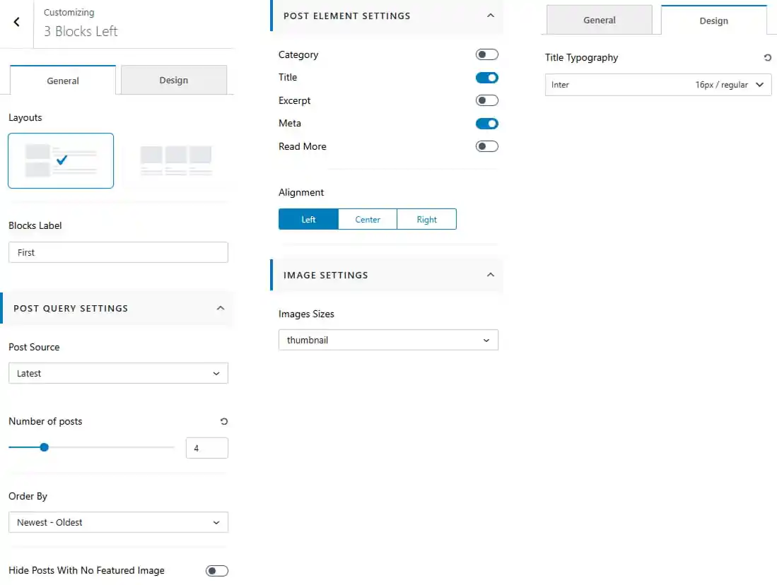
Block Settings
When you click Edit First Block, Edit Second Block, or Edit Third Block, the respective block settings open.
- Choose the available layouts.
- Set the block label for the selected block.
- Select the post source to determine which posts are displayed.
- Set the number of posts to display.
- Choose the post order for the displayed posts.
- Show or hide posts without a featured image.
- Show or hide individual post elements.
- Set the post content alignment to Left, Center, or Right.
- Choose the image size from the available options.
- Customize the title typography including font family, size, and weight.
Pro Version
- Dashboard > Appearance > Customize > Frontpage Sections > 3 Blocks
- Choose the block layout from the available options.
- Choose the container layout for the section.
- Show / hide and re-order the three blocks according to your preference.
- Edit the First Block to customize its content and settings.
- Edit the Second Block to customize its content and settings.
- Edit the Third Block to customize its content and settings.
- Navigate to the Design tab to set the section background.
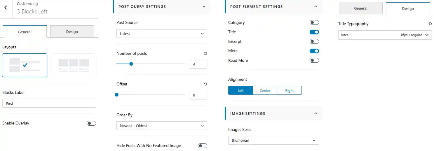
Block Settings
When you click Edit First Block, Edit Second Block, or Edit Third Block, the respective block settings open.
- Choose the available layouts.
- Set the block label for the selected block.
- Enable or disable the overlay for the block.
- Select the post source to determine which posts are displayed.
- Set the number of posts to display.
- Set the post offset to skip a specific number of posts.
- Choose the post order for the displayed posts.
- Show or hide posts without a featured image.
- Show or hide individual post elements.
- Set the post content alignment to Left, Center, or Right.
- Choose the image size from the available options.
- Customize the title typography including font family, size, and weight.
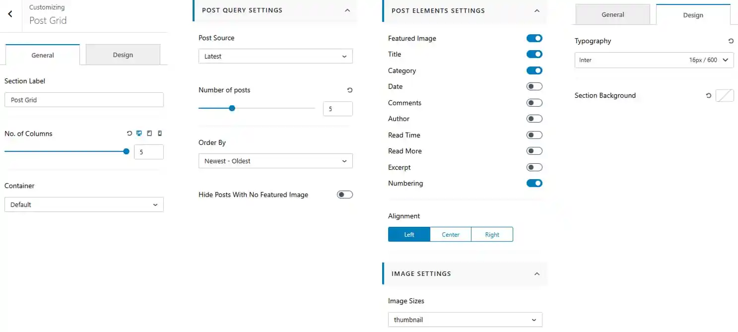
To work on Post Grid
- Dashboard > Appearance > Customize > Frontpage Sections > Post Grid
- Enter a section label for the Post Grid section.
- Set the number of columns for the post layout.
- Choose the container layout for the section.
- Select the post source to determine which posts are displayed.
- Set the number of posts to display.
- Choose the post order for the displayed posts.
- Show or hide posts without a featured image.
- Show or hide individual post elements.
- Set the post content alignment to Left, Center, or Right.
- Choose the image size from the available options.
- Customize the section typography including font family, size, and weight.
- Set the section background color.
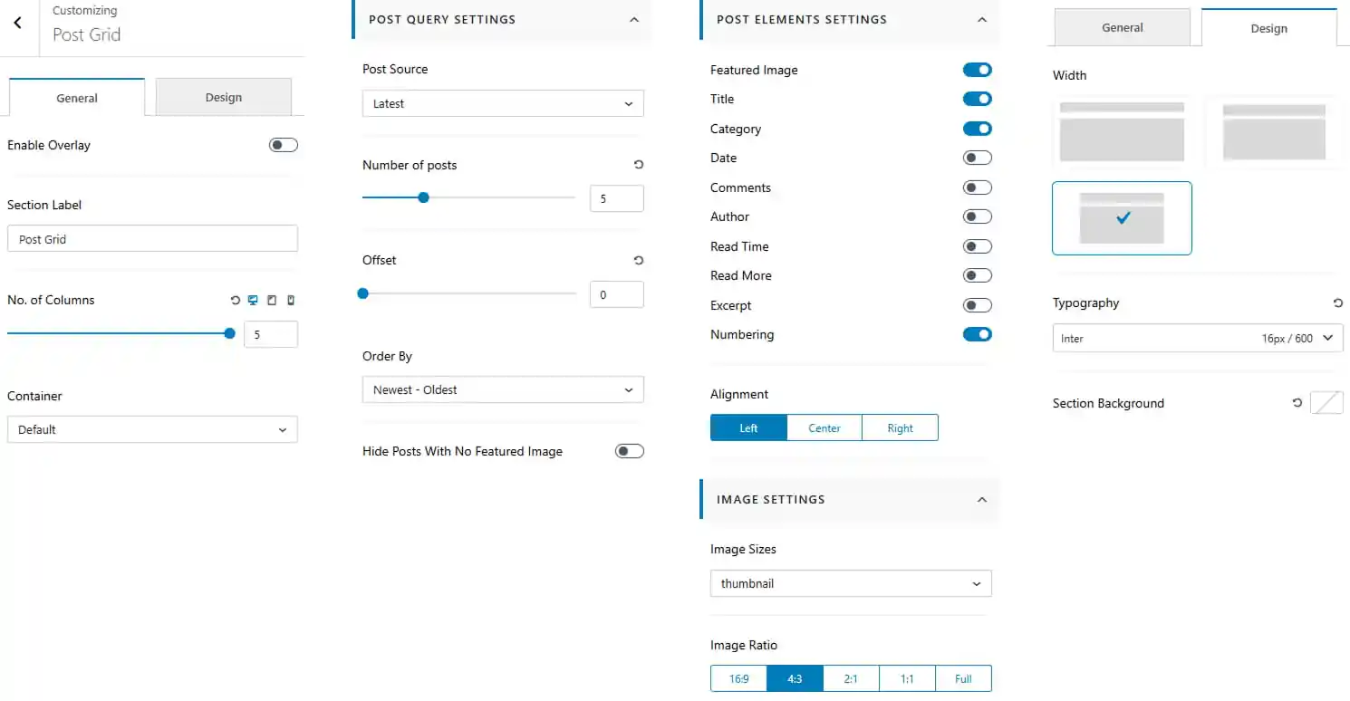
Pro Version
- Dashboard > Appearance > Customize > Frontpage Sections > Post Grid
- Toggle to enable overlay.
- Enter a section label for the Post Grid section.
- Set the number of columns for the post layout.
- Choose the container layout for the section.
- Select the post source to determine which posts are displayed.
- Set the number of posts to display.
- Set the post offset to skip a specific number of posts.
- Choose the post order for the displayed posts.
- Show or hide posts without a featured image.
- Show or hide individual post elements.
- Set the post content alignment to Left, Center, or Right.
- Choose the image size from the available options.
- Select the image ratio such as 16:9, 4:3, 2:1, 1:1, or Full.
- Choose the post list width/layout from the available options.
- Customize the section typography including font family, size, and weight.
- Set the section background color.
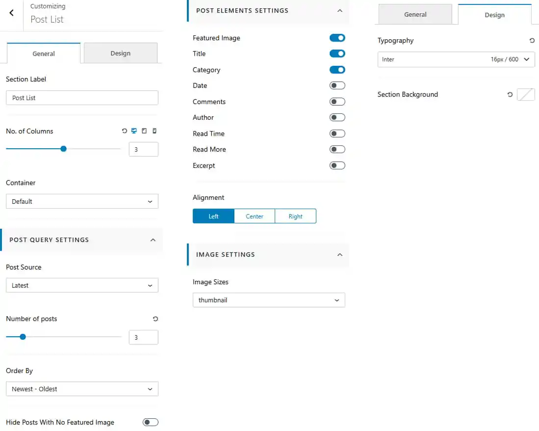
To work on Post List
- Dashboard > Appearance > Customize > Frontpage Sections > Post List
- Enter a section label for the Post List section.
- Set the number of columns for the post layout.
- Choose the container layout for the section.
- Select the post source to determine which posts are displayed.
- Set the number of posts to display.
- Choose the post order for the displayed posts.
- Show or hide posts without a featured image.
- Show or hide individual post elements.
- Set the post content alignment to Left, Center, or Right.
- Choose the image size from the available options.
- Customize the section typography including font family, size, and weight.
- Set the section background color.
Pro Version
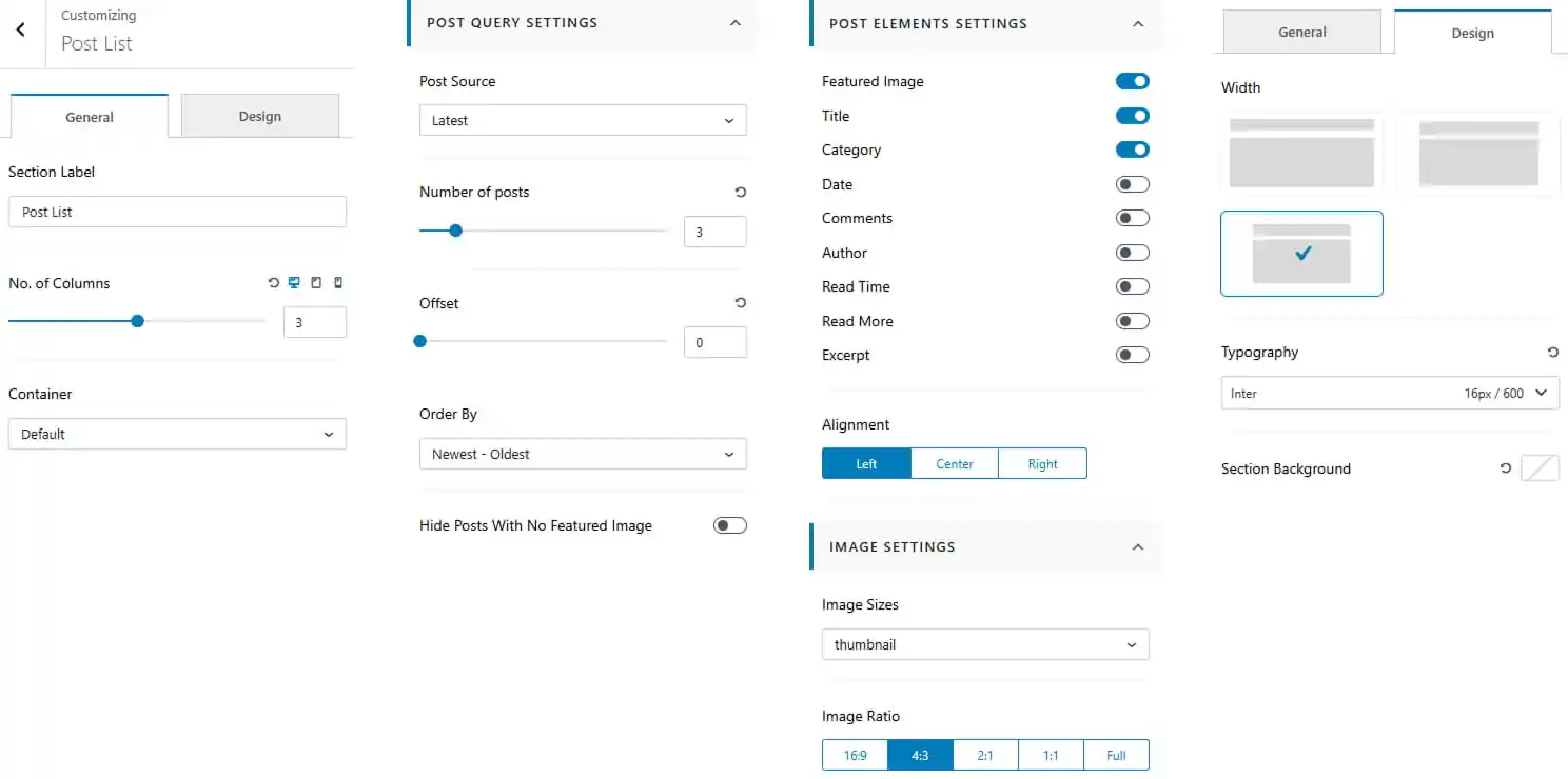
- Dashboard > Appearance > Customize > Frontpage Sections > Post List
- Enter a section label for the Post List section.
- Set the number of columns for the post layout.
- Choose the container layout for the section.
- Select the post source to determine which posts are displayed.
- Set the number of posts to display.
- Set the post offset to skip a specific number of posts.
- Choose the post order for the displayed posts.
- Show or hide posts without a featured image.
- Show or hide individual post elements.
- Set the post content alignment to Left, Center, or Right.
- Choose the image size from the available options.
- Select the image ratio such as 16:9, 4:3, 2:1, 1:1, or Full.
- Choose the post list width/layout from the available options.
- Customize the section typography including font family, size, and weight.
- Set the section background color.
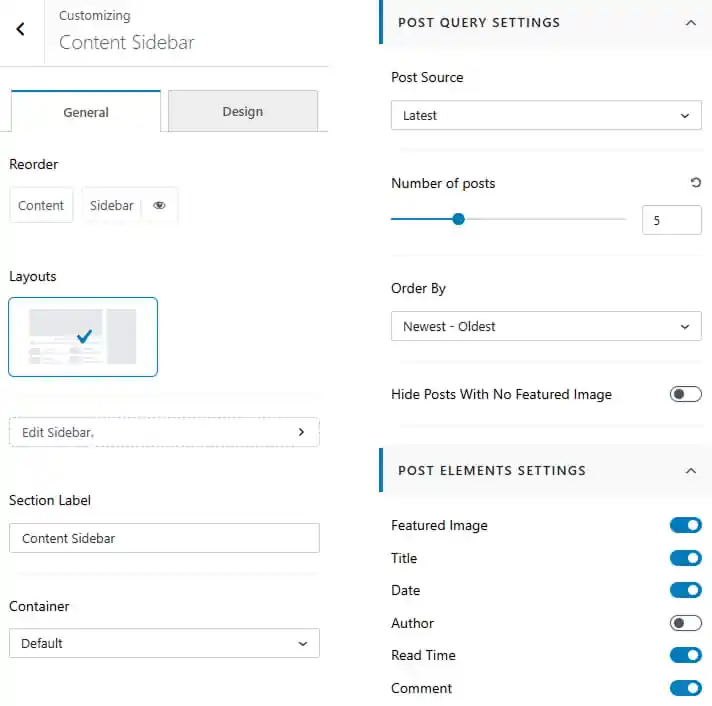
To work on Content Sidebar
- Dashboard > Appearance > Customize > Frontpage Sections > Content Sidebar
- Order the content and sidebar layout according to your preference.
- Edit the sidebar from the available settings.
- Enter a section label for the Content Sidebar section.
- Choose the container layout for the section.
- Select the post source to determine which posts are displayed.
- Set the number of posts to display.
- Choose the post order for the displayed posts.
- Show or hide posts without a featured image.
- Show or hide individual post elements
- Customize the section typography including font family, size, and weight.
- Set the section background color.
Pro Version
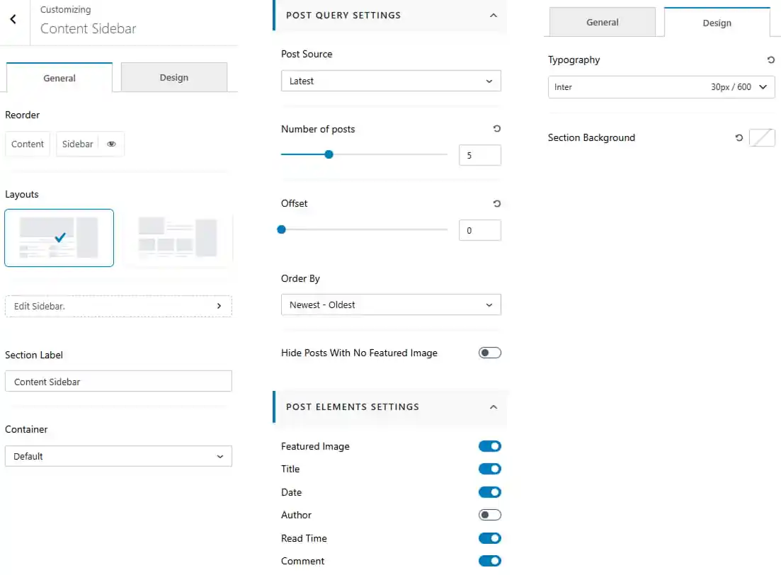
- Dashboard > Appearance > Customize > Frontpage Sections > Content Sidebar
- Order the content and sidebar layout according to your preference.
- Choose the content layout from the available options.
- Edit the sidebar from the available settings.
- Enter a section label for the Content Sidebar section.
- Choose the container layout for the section.
- Select the post source to determine which posts are displayed.
- Set the number of posts to display.
- Set the post offset to skip a specific number of posts.
- Choose the post order for the displayed posts.
- Show or hide posts without a featured image.
- Show or hide individual post elements
- Customize the section typography including font family, size, and weight.
- Set the section background color.
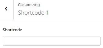
To work on Shortcode
There are two Shortcode to work with.
- Dashboard > Appearance > Customize > Frontpage Sections > Shortcode
- Enter a shortcode.
To work on Widget Area
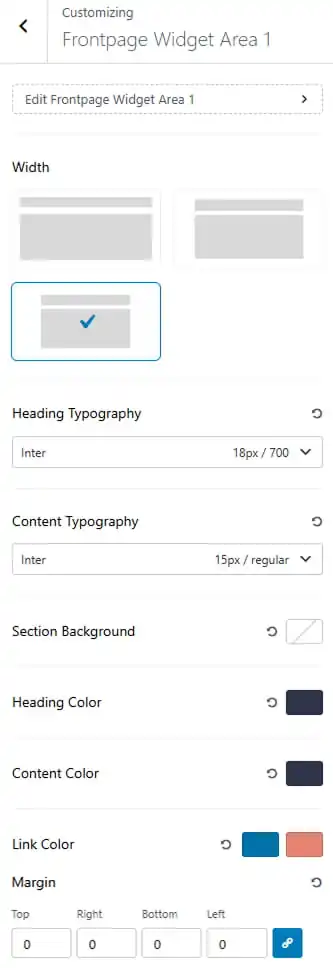
There are two widget areas to work with.
- Dashboard > Appearance > Customize > Frontpage Sections > Widget Area
- Choose the image width/layout from the available options.
- Set the heading and content typography including font family, size, and weight.
- Set section background color.
- Choose the heading and content color.
- Choose the link color and its hover state.
- Adjust the widget margin for Top, Right, Bottom, and Left.
14. Blog / Archive
To work on General Settings
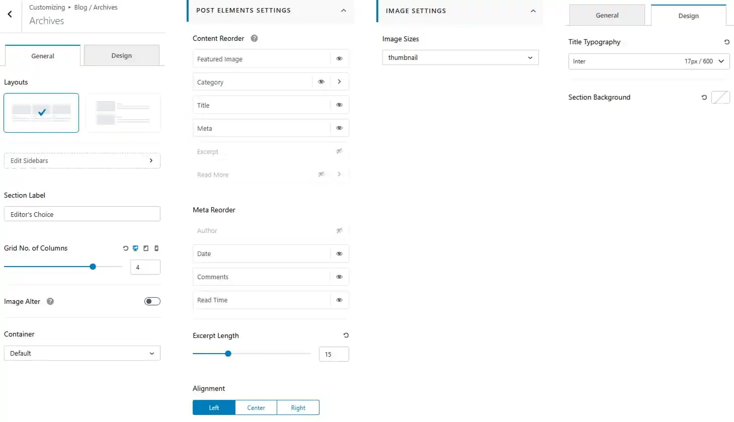
- Dashboard > Appearance > Customize > Blog / Archive > Archives
- Choose the archive layouts from the available layouts.
- Enter a section label.
- Choose number of columns to show.
- Toggle to alter image.
- Choose the container layout for the section.
- Show or hide and re-order individual post elements.
- Show or hide and re-order the meta elements.
- Set the excerpt length.
- Set the post content alignment to Left, Center, or Right.
- Choose the image size from the available options.
- Navigate to the Design tab to customize the Archives appearance.
- Customize the title typography.
- Set the background color.
Pro Version
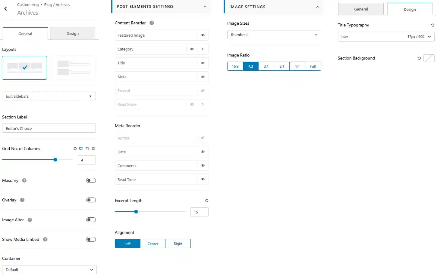
- Dashboard > Appearance > Customize > Blog / Archive > Archives
- Choose the archive layouts from the available layouts.
- Enter a section label.
- Choose number of columns to show.
- Toggle to enable masonry layout for posts.
- Toggle to enable overlay for posts.
- Toggle to alter image.
- Toggle to show media embed.
- Choose the container layout for the section.
- Show or hide and re-order individual post elements.
- Show or hide and re-order the meta elements.
- Set the excerpt length.
- Set the post content alignment to Left, Center, or Right.
- Choose the image size from the available options.
- Select the image ratio such as 16:9, 4:3, 2:1, 1:1, or Full.
- Navigate to the Design tab to customize the Archives appearance.
- Customize the title typography.
- Set the background color.
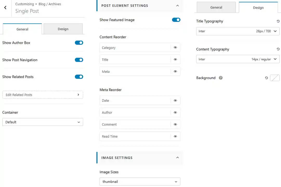
To work on Single Post
- Dashboard > Appearance > Customize > Blog / Archive > Single Post
- Toggle to show author box, post navigation and related posts.
- Choose the container layout for the section.
- Toggle to show featured image.
- Show or hide and re-order individual post elements.
- Show or hide and re-order the meta elements.
- Choose the image size from the available options.
- Navigate to the Design tab to customize the single post appearance.
- Customize the title and content typography.
- Set the background color.
Pro Version
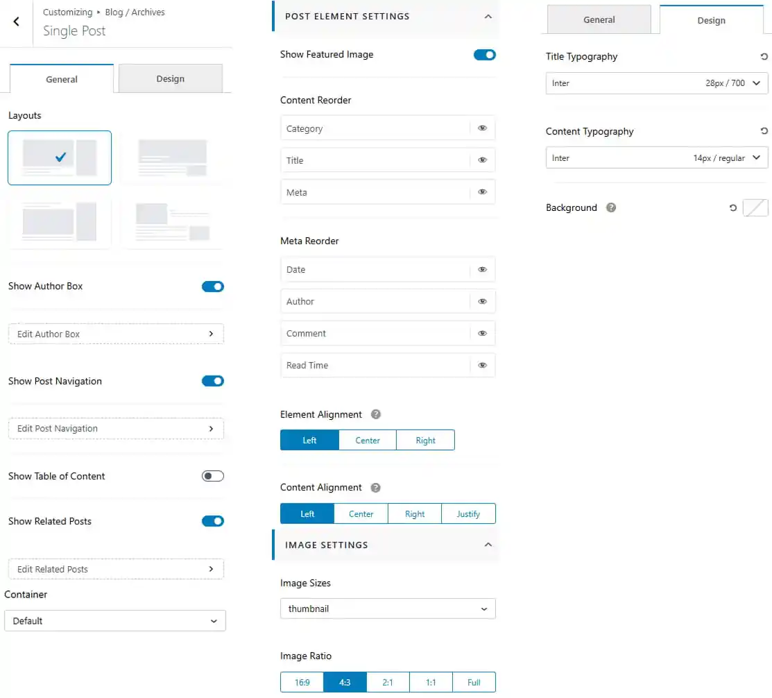
- Dashboard > Appearance > Customize > Blog / Archive > Single Post
- Choose the single layouts from the available layouts.
- Toggle to show author box, post navigation and related posts.
- Toggle to show table of content.
- Choose the container layout for the section.
- Toggle to show featured image.
- Show or hide and re-order individual post elements.
- Show or hide and re-order the meta elements.
- Set the element alignment to Left, Center, or Right.
- Set the content alignment to Left, Center, Right or justify.
- Choose the image size from the available options.
- Select the image ratio such as 16:9, 4:3, 2:1, 1:1, or Full.
- Navigate to the Design tab to customize the single post appearance.
- Customize the title and content typography.
- Set the background color.
To work on Single Page
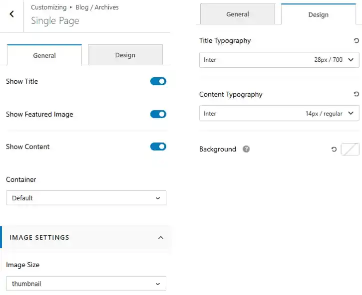
- Dashboard > Appearance > Customize > Blog / Archive > Single Page
- Toggle to show title, featured image and content.
- Choose the container layout for the section.
- Choose the image size from the available options.
- Navigate to the Design tab to customize the single page appearance.
- Customize the title and content typography.
- Set the background color.
Pro Version
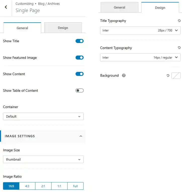
- Dashboard > Appearance > Customize > Blog / Archive > Single Page
- Toggle to show title, featured image and content.
- Toggle to show table of content.
- Choose the container layout for the section.
- Choose the image size from the available options.
- Select the image ratio such as 16:9, 4:3, 2:1, 1:1, or Full.
- Navigate to the Design tab to customize the single page appearance.
- Customize the title and content typography.
- Set the background color.
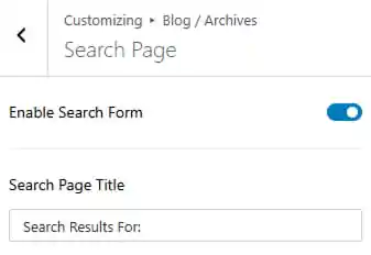
To work on Search Page
- Dashboard > Appearance > Customize > Blog / Archive > Search Page
- Toggle to show search form
- Enter a search page title.
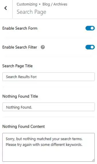
Pro Version
- Dashboard > Appearance > Customize > Blog / Archive > Search Page
- Toggle to show search form.
- Toggle to show search filter
- Enter a search page title.
- Enter a nothing found content.
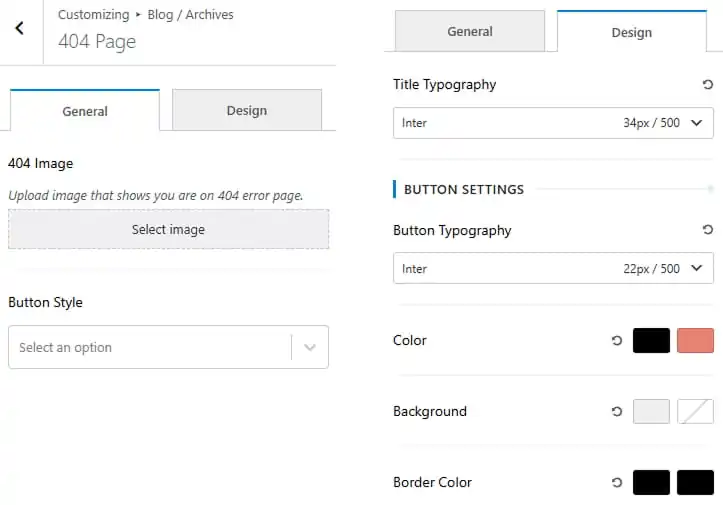
To work on 404 Page
- Dashboard > Appearance > Customize > Blog / Archive > 404 Page
- Upload 404 image
- Choose the button style from the available options.
- Navigate to the Design tab to customize the 404 page appearance.
- Customize the title typography.
- Customize the button typography.
- Set the button color and hover color.
- Set the button background color and hover color.
- Set the button border color and hover color.
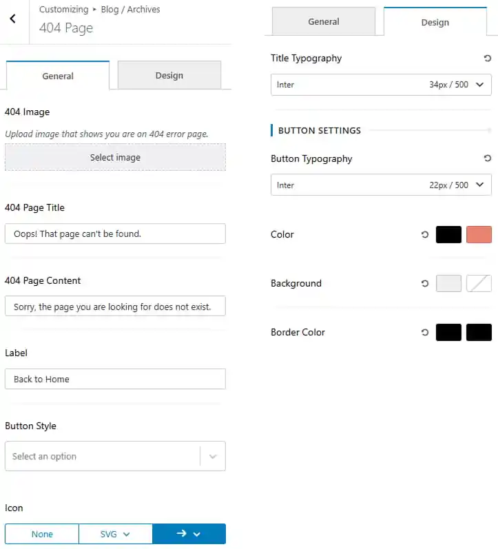
Pro Version
- Dashboard > Appearance > Customize > Blog / Archive > 404 Page
- Upload 404 image
- Enter a 404 page title.
- Enter a 404 page content.
- Enter a 404 button label.
- Choose the button style from the available options.
- Choose an icon for the button from the available options.
- Navigate to the Design tab to customize the 404 page appearance.
- Customize the title typography.
- Customize the button typography.
- Set the button color and hover color.
- Set the button background color and hover color.
- Set the button border color and hover color.
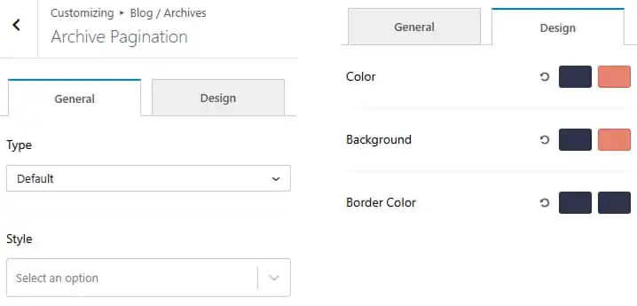
To work on Archive Pagination
- Dashboard > Appearance > Customize > Blog / Archive > Archive Pagination
- Choose pagination type from dropdown.
- Choose the pagination style from the available options.
15. You May Have Missed
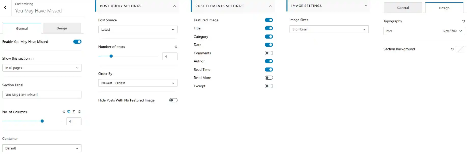
To work on You May Have Missed
- Dashboard > Appearance > Customize > You May Have Missed
- Enable or disable the “You May Have Missed” section.
- Choose where to display the section from the available page options.
- Enter a section label for the “You May Have Missed” section.
- Set the number of columns for the post layout.
- Choose the container layout for the section.
Post Query Settings
- Select the post source to determine which posts are displayed.
- Set the number of posts to display in the section.
- Set the post offset to skip a specific number of posts.
- Choose the post order.
- Enable or disable hiding posts without a featured image.
Post Elements Settings
- Show or hide individual post elements.
- Set the post content alignment to Left, Center, or Right.
Image Settings
- Choose the image size from the available options.
Design Tab
- Navigate to the Design tab to customize.
- Customize the title typography.
- Set the section background.
Pro Version
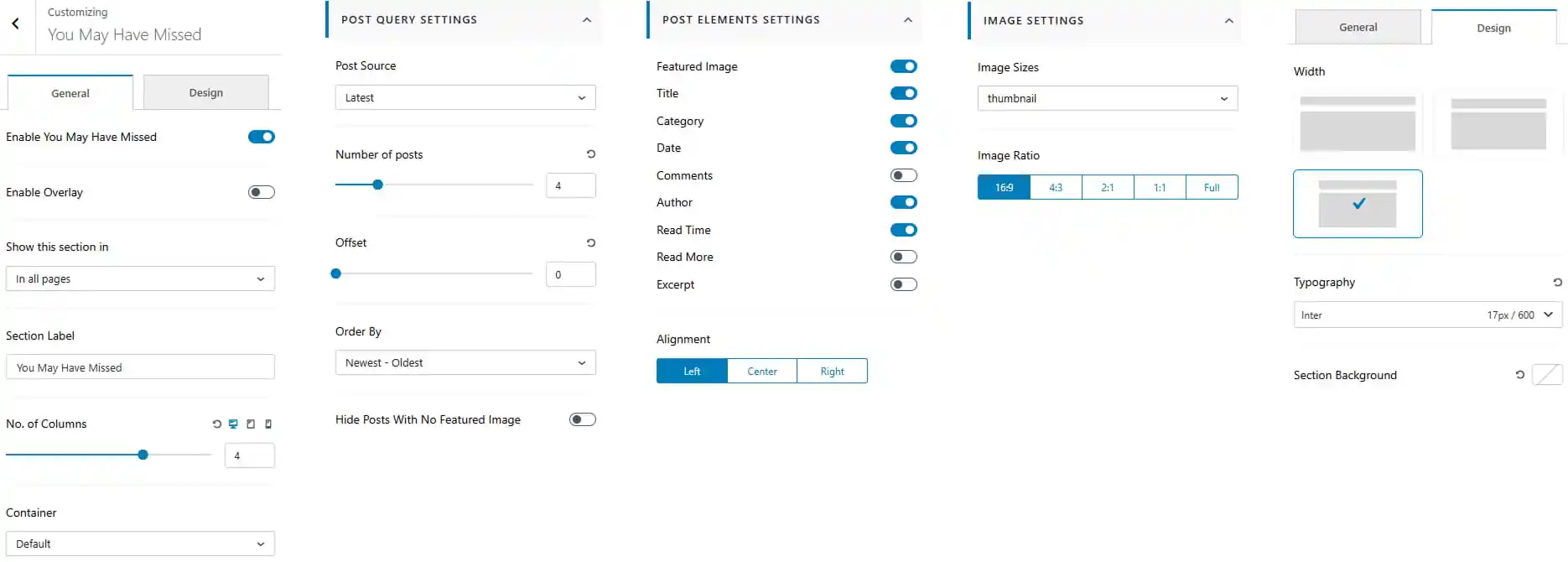
- Dashboard > Appearance > Customize > You May Have Missed
- Enable or disable the “You May Have Missed” section.
- Enable or disable the overlay on the section.
- Choose where to display the section from the available page options.
- Enter a section label for the “You May Have Missed” section.
- Set the number of columns for the post layout.
- Choose the container layout for the section.
Post Query Settings
- Select the post source to determine which posts are displayed.
- Set the number of posts to display in the section.
- Set the post offset to skip a specific number of posts.
- Choose the post order.
- Enable or disable hiding posts without a featured image.
Post Elements Settings
- Show or hide individual post elements.
- Set the post content alignment to Left, Center, or Right.
Image Settings
- Choose the image size from the available options.
- Select the image ratio such as 16:9, 4:3, 2:1, 1:1, or Full.
Design Tab
- Navigate to the Design tab to customize.
- Choose the image width/layout from the available options.
- Customize the title typography.
- Set the section background.
16. Footer Builder
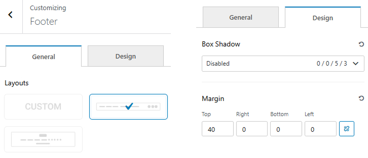
To work on Footer Builder
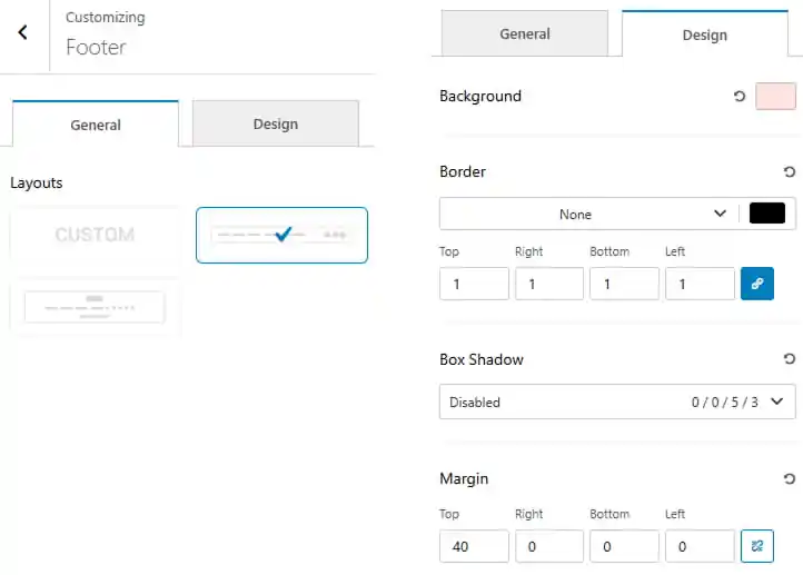
- Dashboard > Appearance > Customize > Footer Builder
- Choose the footer layout from the available options.
- Navigate to the Design tab to customize the footer appearance.
- Set the box shadow effect.
- Adjust the footer margin for Top, Right, Bottom, and Left.
Pro Version
- Dashboard > Appearance > Customize > Footer Builder
- Choose the footer layout from the available options.
- Navigate to the Design tab to customize the card appearance.
- Set the footer background color.
- Customize the border style, width, and color.
- Set the box shadow effect.
- Adjust the footer margin for Top, Right, Bottom, and Left.
To work on Logo
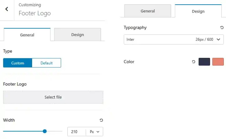
- Dashboard > Appearance > Customize > Footer Builder > Logo
- Choose logo type custom or default
- Upload footer logo
- Modify logo width
- Navigate to the Design tab to customize the logo appearance.
- Set the typography including font family, size, and weight.
- Choose the text color for the logo and its hover state.
Pro Version
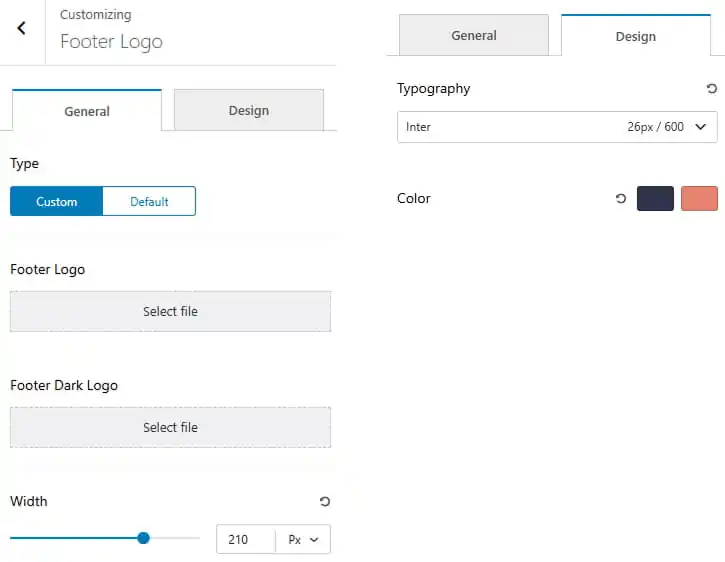
- Choose logo type custom or default
- Upload footer logo for light mode and dark mode as well.
- Modify logo width
- Navigate to the Design tab to customize the logo appearance.
- Set the typography including font family, size, and weight.
- Choose the text color for the logo and its hover state.
To work on Social Icons
- Dashboard > Appearance > Customize > Footer Builder > Social Icons
- Choose social icon to show from dropdown.
- Click to open in new tab or same tab.
- Toggle to enable labels.
- Select the icon style from the dropdown.
- Navigate to the Design tab to customize the button appearance.
- Set the typography including font family, size, and weight.
- Choose the label color and its hover state.
- Choose the icon color and its hover state.
- Choose the icon background color and its hover state.
- Choose the icon border color and its hover state.
- Set icon spacing.
Pro Version
- Dashboard > Appearance > Customize > Header Builder > Social Icons
- Choose social icon to show from dropdown.
- Click to add new social icon.
- Click to open in new tab or same tab.
- Toggle to enable labels.
- Select the icon style from the dropdown.
- Select icon animation from dropdown.
- Navigate to the Design tab to customize the button appearance.
- Toggle to use official brand colors.
- Set the typography including font family, size, and weight.
- Choose the label color and its hover state.
- Choose the icon color and its hover state.
- Choose the icon background color and its hover state.
- Choose the icon border color and its hover state.
- Set icon width / height.
- Customize icon size.
- Set icon spacing.
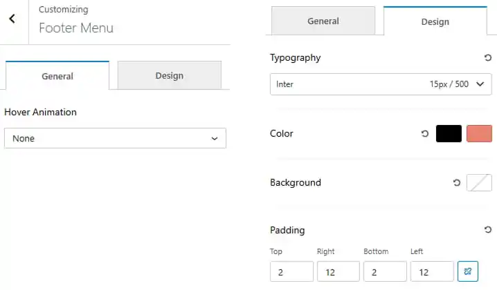
To work on Footer Menu
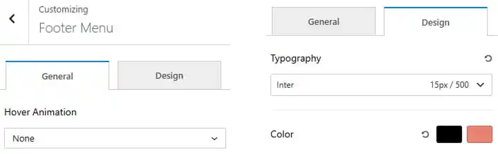
- Dashboard > Appearance > Customize > Footer Builder > Footer Menu
- Select menu hover animation from dropdown.
- Navigate to the Design tab to customize the menu appearance.
- Set the typography including font family, size, and weight.
- Choose the menu color and its hover state.
Pro Version
- Dashboard > Appearance > Customize > Footer Builder > Footer Menu
- Select menu hover animation from dropdown.
- Navigate to the Design tab to customize the menu appearance.
- Set the typography including font family, size, and weight.
- Choose the menu color and its hover state.
- Choose the menu background color.
- Adjust the menu padding for Top, Right, Bottom, and Left.
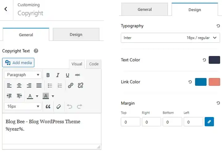
To work on Copyright
- Dashboard > Appearance > Customize > Footer Builder > Copyright
- Change copyright text.
- Navigate to the Design tab to customize the copyright appearance.
- Set the typography including font family, size, and weight.
- Choose the copyright text color.
- Choose the copyright link color.
- Adjust the copyright margin for Top, Right, Bottom, and Left.
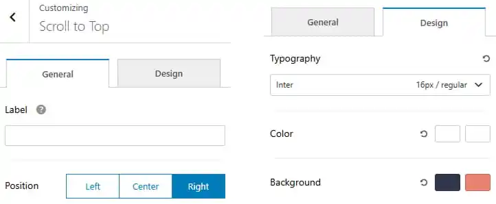
To work on Scroll to Top
- Dashboard > Appearance > Customize > Footer Builder > Scroll to Top
- Enter a label for the scroll to top.
- Choose scroll to top position to left, center or right.
- Navigate to the Design tab to customize the scroll to top appearance.
- Set the typography including font family, size, and weight.
- Choose the scroll to top color and its hover state.
- Choose the scroll to top background color and its hover state.
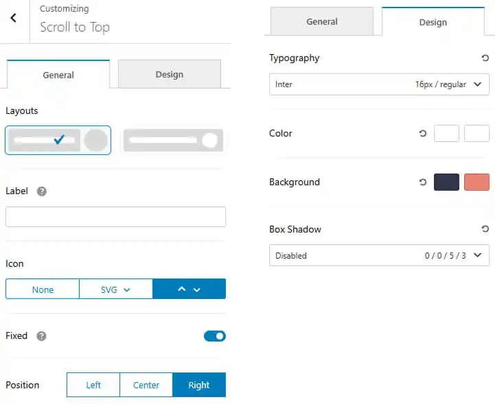
Pro Version
- Dashboard > Appearance > Customize > Footer Builder > Scroll to Top
- Choose the scroll to to layout from the available options.
- Enter a label for the scroll to top.
- Choose an icon for the scroll to top from the available options.
- Toggle to make scroll to top button fixed.
- Choose scroll to top position to left, center or right.
- Navigate to the Design tab to customize the scroll to top appearance.
- Set the typography including font family, size, and weight.
- Choose the scroll to top color and its hover state.
- Choose the scroll to top background color and its hover state.
- Configure the box shadow using the available options.
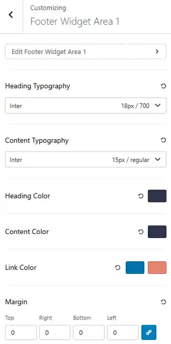
To work on Widgets
There are three widget areas to work with.
- Dashboard > Appearance > Customize > Footer Builder > Widgets
- Set the heading and content typography including font family, size, and weight.
- Choose the heading and content color.
- Choose the link color and its hover state.
- Adjust the widget margin for Top, Right, Bottom, and Left.
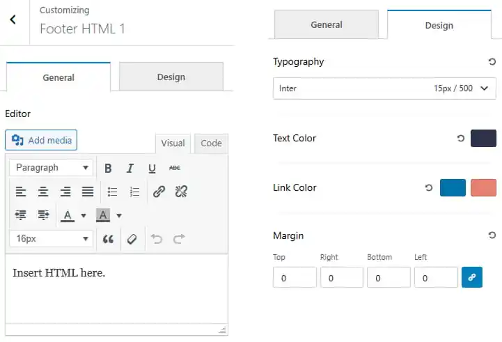
To work on HTML
There are two HTML to work with.
- Dashboard > Appearance > Customize > Footer Builder > HTML
- Choose the copyright text color.
- Inset the html.
- Navigate to the Design tab to customize the HTML appearance.
- Set the typography including font family, size, and weight.
- Choose the text color and its hover state.
- Choose the link color and its hover state.
- Adjust the margin for Top, Right, Bottom, and Left.
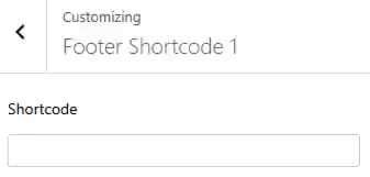
To work on Shortcode
There are two Shortcode to work with.
- Dashboard > Appearance > Customize > Footer Builder > Shortcode
- Enter a shortcode.
To work on Divider
There are three Divider to work with.
- Dashboard > Appearance > Customize > Footer Builder > Divider
- Choose divider style.
- Set width and height of the divider.
- Navigate to the Design tab to customize the divider appearance.
- Set the divider color.
- Adjust the margin for Top, Right, Bottom, and Left.
To work on Image
- Dashboard > Appearance > Customize > Footer Builder > Image
- Upload an image
- Place your URL
- Click to open in new tab or same tab
- Choose rel attribute from dropdown
17. Header Image
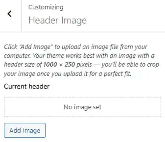
To work on Header Image
- Dashboard > Appearance > Customize > Header Image
- Click to add image.
18. Background
To work on Background
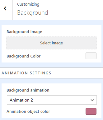
- Dashboard > Appearance > Customize > Background
- Select background image
- Choose background animation to show from dropdown
- Change animation object color

Pro Version
- Dashboard > Appearance > Customize > Background
- Select background image
- Change background color
- Choose background animation to show from dropdown
- Change animation object color
19. Menu
To work on menu
- Dashboard > Appearance > Menus

20. Widgets
To work on Header Image
- Dashboard > Appearance > Widgets
- Click to add new widgets
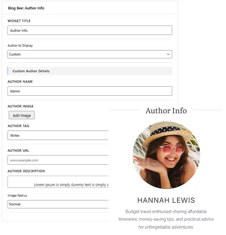
- Search for “Author Info” in search area
- Drag and drop the widget in sidebar
- Select author to display custom or admin
- Add the widget title
- Add author name
- Add author image
- Add author tag and url
- Add author description
- Customize image radius
To work on Carousel Posts
- Dashboard > Appearance > Widgets
- Click to add new widgets
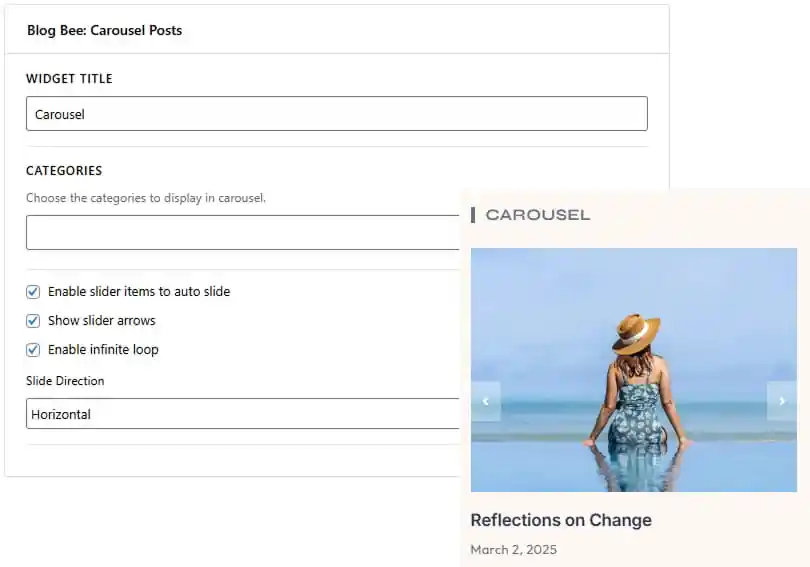
- Search for “Carousel Posts” in search area
- Drag and drop the widget in sidebar
- Add Widget title
- Choose the category from dropdown
- Enable slider item to auto slide
- Enable slider arrows
- Enable infinite loop
- Choose slider to slide in vertical or horizontal direction
To work on Category Collection
- Dashboard > Appearance > Widgets
- Click to add new widgets
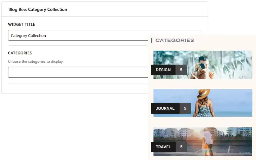
- Search for “Category Collection” in search area
- Drag and drop the widget in sidebar
- Add widget title
- Choose the categories to display
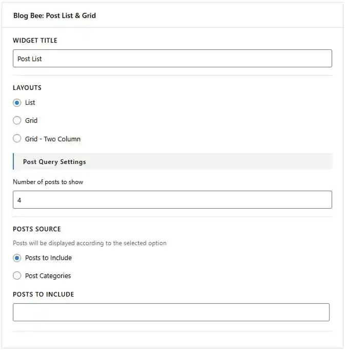
To work on Post List & Grid
- Dashboard > Appearance > Widgets
- Click to add new widgets
- Search for “Post List & Grid” in search area
- Drag and drop the widget in sidebar
- Enter the widget title to display above the post list or grid.
- Choose the layout as List, Grid, or Grid – Two Column.
- Select a layout variant from the available options.
- Set the number of posts to display.
- Choose the post source as Posts to Include or Post Categories.
- Select the posts or categories to include in the widget.
- Enable or disable the Show Load More button to allow visitors to load additional posts.
Pro Version
- Dashboard > Appearance > Widgets
- Click to add new widgets
- Search for “Post List & Grid” in search area
- Drag and drop the widget in sidebar
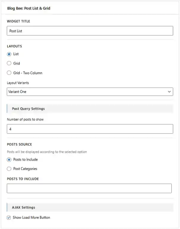
- Enter the widget title to display above the post list or grid.
- Choose the layout as List, Grid, or Grid – Two Column.
- Select a layout variant from the available options.
- Set the number of posts to display.
- Choose the post source as Posts to Include or Post Categories.
- Select the posts or categories to include in the widget.
- Enable or disable the Show Load More button to allow visitors to load additional posts.
To work on Social Icons
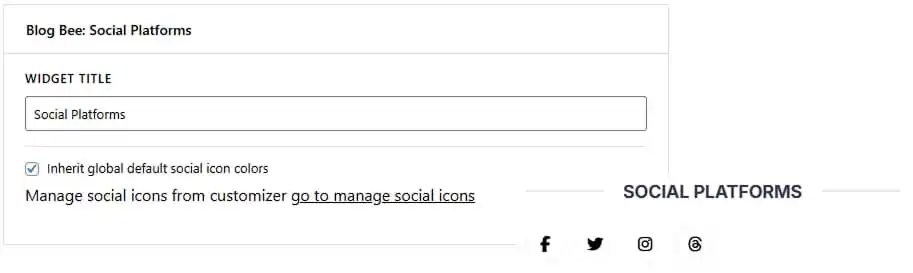
- Dashboard > Appearance > Widgets
- Click to add new widgets
- Search for “Social Icons” in search area
- Drag and drop the widget in sidebar
- Customize Social Icons widget with available controls
21. Homepage Settings
To work on Homepage Settings
- Dashboard > Settings > Reading

Pro Version
To work on Social Share