News Block - Documentation
- Getting Started
- Installation
- Demo Import
- Homepage Setup
- Gutenberg Blocks
- Elementor Widgets
- Preloader Settings
- Site Settings
- Top Header Section
- Header Section
- Layouts Settings
- Sidebar Layouts
- Footer Settings
- Breadcrumb Settings
- InnerPages Settings
- Typography Settings
Getting Started
News Block – Multipurpose/ News / Magazine / Blogging Theme
News Block is the multipurpose WordPress News Theme crafted beautifully with advanced features which is easy to use.
Fully compatible with WordPress popular theme builder Elementor and Gutenberg. With easy Drag & Drop you can give professional layouts to your websites. Compatible with latest WordPress version and with Few Easy Steps you can import any available demos to setup your website.
Create news websites with news block template. Being multipurpose theme it is perfect for news and blog website.
Installation
- Get a copy of News Block Theme
- Log in to the WordPress Administration Panel.
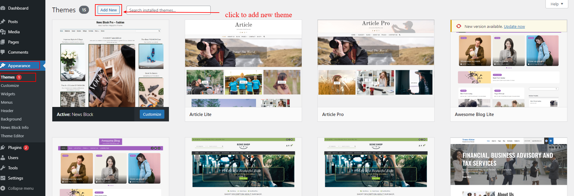
- Click on Appearance -> Themes -> Add New
- Click on Upload Theme button at the top and browse the news-block.zip ( news-block-pro.zip ) file in your computer.
- Click on Install button and then Activate the theme.


- Get a copy of News Block Theme ( buy News Block Pro from the store)
- Unzip the downloaded zip file.
- Upload the unzipped file in to /wp-content/themes/
- Now, activate the theme by going to Appearance -> Themes in the wordpress dashboard.
- Activate the News Block and Click on “Customize” in the Appearance Menu in the Dashboard. Now you can customize or modify according to your choice.
Demo Import
After you activate News Block theme in your website. You can use demo import to make your site look like one of our available demos.
- Go to Appearance > News Block Info
- You can see list of free and premium available demos in this page
- If you have not install/activate the Blazethemes Demo Importer plugin Click on install/activate demo importer button just above the demos listing section

- Then, hover onto the demo you want to import and Click Install

- It will land you to the demo importer setting page
1. Check the box if you want to reset your website data before demo import( Note : It will erase all of your posts, pages, media and website data )
2. Uncheck box if you donot want to erase your previous data. ( Note : Your site may not look exactly like demo as your previous posts, pages, categories or tags may collide with new datas ) - Final Note: Always backup your website before resetting website for demo import.
- Finally, your site now looks exactly like a demo. Go on and Customize further with your choice

Homepage Setup
For News Block theme you have to setup frontpage in following methods:
- Goto Appearance > Customizer
- In customizer section Go to Homepage Settings
- Select A Static Page and in Homepage dropdown options Choose any of your page that displays on site frontpage
- To add various post layouts and give you homepage a new look. There are two ways you can design your homepage
1. Gutenberg Editor ( Navigate to Gutenberg Block Section )
2. 1. Elementor Page Builder ( Navigate to Elementor Widgets Section )
Gutenberg Blocks
News Block is fully compatible with Gutenberg Block Editor. To take full advantage of gutenberg blocks layouts provided by theme.
Gutenberg Block Editor must be activated which is default editor of latest WordPress Version.
To add theme gutenberg blocks, you must go to Dashboard > Pages > Add New > Click on the + button at the top left corner of edit page. ( You can add in your existing page or post too )

After you insert Post Grid,
Click onthe settings icon at the top right corner and tap Block Tab
General Tab
- Choose the block layouts from the available layouts
- In Basic Settings, show/hide block title
- Add the block title text
- Choose the block title layout
- From multicheckbox field, choose the categories you want to display posts from
- To display specific post, add the valid post if in the “Post IDs” field
- Show/Hide read more button
- Add read more button text

In Query Settings,
- Customize the number of posts to display in Post Count field
- you can order, filter and show/hide the elements as you want. Below Image shows the available options

In Pagination Settings
- Show or hide the pagination in the block
- Choose type of pagination from select dropdown options

In Extra Settings
- Choose the option from dropdown to change link open target
- Change the image hover type for the image displayed inside the block
In Fallback Image
- Upload the fallback image for the block. ( fallback image are displayed when post displayed inside the block doesnot have the featured image )

Style Tab
To continue customizing the block style, You can tap on the Style tab at the block settings tab at the left side.
- Toggle the option for the post format icon
- Select image size from dropdown select field
In Color Settings,
- Choose the color as your choice
- Primary color is applied in the block element hover color, block title border or background color

In Typography Settings,
In this panel tab section, Toggle the field “Enable block typography” to apply the changes made in this typography fields.
Available elements typography settings are :
– Block Title
– Title
– Meta
– Content/Excerpt
– Button
After you insert Post List,
Click onthe settings icon at the top right corner and tap Block Tab
General Tab
- Choose the block layouts from the available layouts
- In Basic Settings, show/hide block title
- Add the block title text
- Choose the block title layout
- From multicheckbox field, choose the categories you want to display posts from
- To display specific post, add the valid post if in the “Post IDs” field
- Show/Hide read more button
- Add read more button text

In Query Settings,
- Customize the number of posts to display in Post Count field
- you can order, filter and show/hide the elements as you want. Below Image shows the available options

In Pagination Settings
- Show or hide the pagination in the block
- Choose type of pagination from select dropdown options
In Extra Settings
- Choose the option from dropdown to change link open target
- Change the image hover type for the image displayed inside the block
In Fallback Image
- Upload the fallback image for the block. ( fallback image are displayed when post displayed inside the block doesnot have the featured image )

Style Tab
To continue customizing the block style, You can tap on the Style tab at the block settings tab at the left side.
- Toggle the option for the post format icon
- Select image size from dropdown select field
In Color Settings,
- Choose the color as your choice
- Primary color is applied in the block element hover color, block title border or background color

In Typography Settings,
In this panel tab section, Toggle the field “Enable block typography” to apply the changes made in this typography fields.
Available elements typography settings are :
– Block Title
– Title
– Meta
– Content/Excerpt
– Button
After you insert Post Grid Alter,
Click onthe settings icon at the top right corner and tap Block Tab
General Tab
- Choose the block layouts from the available layouts
- In Basic Settings, show/hide block title
- Add the block title text
- Choose the block title layout
- From multicheckbox field, choose the categories you want to display posts from
- To display specific post, add the valid post if in the “Post IDs” field
- Show/Hide read more button
- Add read more button text

In Query Settings,
- Customize the number of posts to display in Post Count field
- you can order, filter and show/hide the elements as you want. Below Image shows the available options

In Extra Settings
- Choose the option from dropdown to change link open target
- Change the image hover type for the image displayed inside the block
In Fallback Image
- Upload the fallback image for the block. ( fallback image are displayed when post displayed inside the block doesnot have the featured image )

Style Tab
To continue customizing the block style, You can tap on the Style tab at the block settings tab at the left side.
- Toggle the option for the post format icon
- Select image size from dropdown select field
In Color Settings,
- Choose the color as your choice
- Primary color is applied in the block element hover color, block title border or background color
In Typography Settings,
In this panel tab section, Toggle the field “Enable block typography” to apply the changes made in this typography fields.
Available elements typography settings are :
– Block Title
– Title
– Meta
– Content/Excerpt
– Button
After you insert Post Carousel,
Click onthe settings icon at the top right corner and tap Block Tab
General Tab
- Choose the block layouts from the available layouts
- In Basic Settings, show/hide block title
- Add the block title text
- Choose the block title layout
- From multicheckbox field, choose the categories you want to display posts from
- To display specific post, add the valid post if in the “Post IDs” field
- Show/Hide read more button
- Add read more button text
In Query Settings,
- Customize the number of posts to display in Post Count field
- you can order, filter and show/hide the elements as you want. Below Image shows the available options
In Extra Settings
- Choose the option from dropdown to change link open target
- Change the image hover type for the image displayed inside the block
In Fallback Image
- Upload the fallback image for the block. ( fallback image are displayed when post displayed inside the block doesnot have the featured image )
Style Tab
To continue customizing the block style, You can tap on the Style tab at the block settings tab at the left side.
- Toggle the option for the post format icon
- Select image size from dropdown select field
In Color Settings,
- Choose the color as your choice
- Primary color is applied in the block element hover color, block title border or background color
In Typography Settings,
In this panel tab section, Toggle the field “Enable block typography” to apply the changes made in this typography fields.
Available elements typography settings are :
– Block Title
– Title
– Meta
– Content/Excerpt
– Button
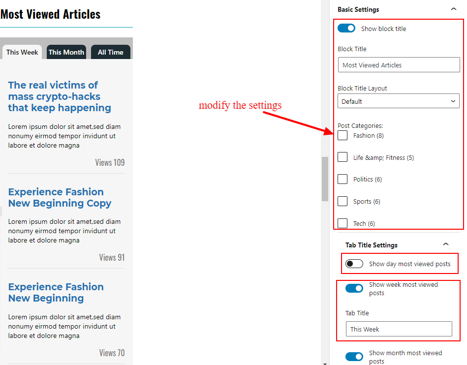
After you insert Post Most Viewed,
Click onthe settings icon at the top right corner and tap Block Tab
General Tab
- Choose the block layouts from the available layouts
- In Basic Settings, show/hide block title
- Add the block title text
- Choose the block title layout
- From multicheckbox field, choose the categories you want to display posts from
- To display specific post, add the valid post if in the “Post IDs” field
- Show/Hide read more button
- Add read more button text
In Query Settings,
- Customize the number of posts to display in Post Count field
- you can order, filter and show/hide the elements as you want. Below Image shows the available options
In Extra Settings
- Choose the option from dropdown to change link open target
- Change the image hover type for the image displayed inside the block
In Fallback Image
- Upload the fallback image for the block. ( fallback image are displayed when post displayed inside the block doesnot have the featured image )

Style Tab
To continue customizing the block style, You can tap on the Style tab at the block settings tab at the left side.
- Toggle the option for the post format icon
- Select image size from dropdown select field
In Color Settings,
- Choose the color as your choice
- Primary color is applied in the block element hover color, block title border or background color

In Typography Settings,
In this panel tab section, Toggle the field “Enable block typography” to apply the changes made in this typography fields.
Available elements typography settings are :
– Block Title
– Title
– Meta
– Content/Excerpt
– Button
After you insert Post Grid Boxed,
Click onthe settings icon at the top right corner and tap Block Tab
General Tab
- Choose the block layouts from the available layouts
- In Basic Settings, show/hide block title
- Add the block title text
- Choose the block title layout
- From multicheckbox field, choose the categories you want to display posts from
- To display specific post, add the valid post if in the “Post IDs” field
- Show/Hide read more button
- Add read more button text

In Query Settings,
- Customize the number of posts to display in Post Count field
- you can order, filter and show/hide the elements as you want. Below Image shows the available options

In Extra Settings
- Choose the option from dropdown to change link open target
- Change the image hover type for the image displayed inside the block
In Fallback Image
- Upload the fallback image for the block. ( fallback image are displayed when post displayed inside the block doesnot have the featured image )

Style Tab
To continue customizing the block style, You can tap on the Style tab at the block settings tab at the left side.
- Toggle the option for the post format icon
- Select image size from dropdown select field
In Color Settings,
- Choose the color as your choice
- Primary color is applied in the block element hover color, block title border or background color

In Typography Settings,
In this panel tab section, Toggle the field “Enable block typography” to apply the changes made in this typography fields.
Available elements typography settings are :
– Block Title
– Title
– Meta
– Content/Excerpt
– Button
Elementor Widgets
News Block is fully compatible with Elementor Page Builder. To take full advantage of elementor widgets layouts provided by theme.
Elementor Plugin must be activated and must have latest WordPress Version.
To add theme elementor widgets, you must go to Dashboard > Pages > Add New > Click on Edit With Elementor at the top bar of edit page. ( You can add in your existing page or post too )
After you insert Post Grid,
Click on the settings icon at the top right corner and tap Block Tab
General Tab
- Choose the block layouts from the available layouts
- In Basic Settings, show/hide block title
- Add the block title text
- Choose the block title layout
- From multicheckbox field, choose the categories you want to display posts from
- To display specific post, add the valid post if in the “Post IDs” field
- Show/Hide read more button
- Add read more button text

In Query Settings,
- Customize the number of posts to display in Post Count field
- you can order, filter and show/hide the elements as you want. Below Image shows the available options

In Pagination Settings
- Show or hide the pagination in the block
- Choose type of pagination from select dropdown options
In Extra Settings
- Choose the option from dropdown to change link open target
- Change the image hover type for the image displayed inside the block
In Fallback Image
- Upload the fallback image for the block. ( fallback image are displayed when post displayed inside the block doesnot have the featured image )

Style Tab
To continue customizing the block style, You can tap on the Style tab at the elementor settings tab on the left side.
- Toggle the option for the post format icon
- Select image size from dropdown select field
In Color Settings,
- Choose the color as your choice
- Primary color is applied in the block element hover color, block title border or background color
In Typography Settings,
In this panel tab section, Toggle the field “Enable block typography” to apply the changes made in this typography fields.
Available elements typography settings are :
– Block Title
– Title
– Meta
– Content/Excerpt
– Button

After you insert Post List,
Click onthe settings icon at the top right corner and tap Block Tab
General Tab
- Choose the block layouts from the available layouts
- In Basic Settings, show/hide block title
- Add the block title text
- Choose the block title layout
- From multicheckbox field, choose the categories you want to display posts from
- To display specific post, add the valid post if in the “Post IDs” field
- Show/Hide read more button
- Add read more button text

In Query Settings,
- Customize the number of posts to display in Post Count field
- you can order, filter and show/hide the elements as you want. Below Image shows the available options

In Pagination Settings
- Show or hide the pagination in the block
- Choose type of pagination from select dropdown options
In Extra Settings
- Choose the option from dropdown to change link open target
- Change the image hover type for the image displayed inside the block
In Fallback Image
- Upload the fallback image for the block. ( fallback image are displayed when post displayed inside the block doesnot have the featured image )
Style Tab
To continue customizing the block style, You can tap on the Style tab at the block settings tab at the left side.
- Toggle the option for the post format icon
- Select image size from dropdown select field
In Color Settings,
- Choose the color as your choice
- Primary color is applied in the block element hover color, block title border or background color
In Typography Settings,
In this panel tab section, Toggle the field “Enable block typography” to apply the changes made in this typography fields.
Available elements typography settings are :
– Block Title
– Title
– Meta
– Content/Excerpt
– Button
After you insert Post Grid Alter,
Click onthe settings icon at the top right corner and tap Block Tab
General Tab
- Choose the block layouts from the available layouts
- In Basic Settings, show/hide block title
- Add the block title text
- Choose the block title layout
- From multicheckbox field, choose the categories you want to display posts from
- To display specific post, add the valid post if in the “Post IDs” field
- Show/Hide read more button
- Add read more button text
In Query Settings,
- Customize the number of posts to display in Post Count field
- you can order, filter and show/hide the elements as you want. Below Image shows the available options
In Extra Settings
- Choose the option from dropdown to change link open target
- Change the image hover type for the image displayed inside the block
In Fallback Image
- Upload the fallback image for the block. ( fallback image are displayed when post displayed inside the block doesnot have the featured image )
Style Tab
To continue customizing the block style, You can tap on the Style tab at the block settings tab at the left side.
- Toggle the option for the post format icon
- Select image size from dropdown select field
In Color Settings,
- Choose the color as your choice
- Primary color is applied in the block element hover color, block title border or background color
In Typography Settings,
In this panel tab section, Toggle the field “Enable block typography” to apply the changes made in this typography fields.
Available elements typography settings are :
– Block Title
– Title
– Meta
– Content/Excerpt
– Button
After you insert Post Carousel,
Click onthe settings icon at the top right corner and tap Block Tab
General Tab
- Choose the block layouts from the available layouts
- In Basic Settings, show/hide block title
- Add the block title text
- Choose the block title layout
- From multicheckbox field, choose the categories you want to display posts from
- To display specific post, add the valid post if in the “Post IDs” field
- Show/Hide read more button
- Add read more button text
In Query Settings,
- Customize the number of posts to display in Post Count field
- you can order, filter and show/hide the elements as you want. Below Image shows the available options
In Extra Settings
- Choose the option from dropdown to change link open target
- Change the image hover type for the image displayed inside the block
In Fallback Image
- Upload the fallback image for the block. ( fallback image are displayed when post displayed inside the block doesnot have the featured image )
Style Tab
To continue customizing the block style, You can tap on the Style tab at the block settings tab at the left side.
- Toggle the option for the post format icon
- Select image size from dropdown select field
In Color Settings,
- Choose the color as your choice
- Primary color is applied in the block element hover color, block title border or background color
In Typography Settings,
In this panel tab section, Toggle the field “Enable block typography” to apply the changes made in this typography fields.
Available elements typography settings are :
– Block Title
– Title
– Meta
– Content/Excerpt
– Button
After you insert Post Most Viewed,
Click onthe settings icon at the top right corner and tap Block Tab
General Tab
- Choose the block layouts from the available layouts
- In Basic Settings, show/hide block title
- Add the block title text
- Choose the block title layout
- From multicheckbox field, choose the categories you want to display posts from
- To display specific post, add the valid post if in the “Post IDs” field
- Show/Hide read more button
- Add read more button text
In Query Settings,
- Customize the number of posts to display in Post Count field
- you can order, filter and show/hide the elements as you want. Below Image shows the available options
In Extra Settings
- Choose the option from dropdown to change link open target
- Change the image hover type for the image displayed inside the block
In Fallback Image
- Upload the fallback image for the block. ( fallback image are displayed when post displayed inside the block doesnot have the featured image )
Style Tab
To continue customizing the block style, You can tap on the Style tab at the block settings tab at the left side.
- Toggle the option for the post format icon
- Select image size from dropdown select field
In Color Settings,
- Choose the color as your choice
- Primary color is applied in the block element hover color, block title border or background color
In Typography Settings,
In this panel tab section, Toggle the field “Enable block typography” to apply the changes made in this typography fields.
Available elements typography settings are :
– Block Title
– Title
– Meta
– Content/Excerpt
– Button
After you insert Post Grid Boxed,
Click onthe settings icon at the top right corner and tap Block Tab
General Tab
- Choose the block layouts from the available layouts
- In Basic Settings, show/hide block title
- Add the block title text
- Choose the block title layout
- From multicheckbox field, choose the categories you want to display posts from
- To display specific post, add the valid post if in the “Post IDs” field
- Show/Hide read more button
- Add read more button text
In Query Settings,
- Customize the number of posts to display in Post Count field
- you can order, filter and show/hide the elements as you want. Below Image shows the available options
In Extra Settings
- Choose the option from dropdown to change link open target
- Change the image hover type for the image displayed inside the block
In Fallback Image
- Upload the fallback image for the block. ( fallback image are displayed when post displayed inside the block doesnot have the featured image )
Style Tab
To continue customizing the block style, You can tap on the Style tab at the block settings tab at the left side.
- Toggle the option for the post format icon
- Select image size from dropdown select field
In Color Settings,
- Choose the color as your choice
- Primary color is applied in the block element hover color, block title border or background color
In Typography Settings,
In this panel tab section, Toggle the field “Enable block typography” to apply the changes made in this typography fields.
Available elements typography settings are :
– Block Title
– Title
– Meta
– Content/Excerpt
– Button
Preloader Settings
To customize preloader in your site.
- Goto Appearance > Customize > Theme Options > Preloader Settings
- Toggle the button to enable/disable preloader
- Choose the color to change background color that appears while preloader is loading
- Choose image to act as a preloader

Site Settings
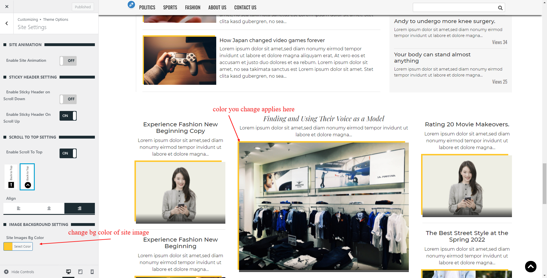
To customize site settings. Go Through Appearance > Customize > Theme Options > Site Settings
- Toggle button in Site Animation section to enable text animation, block animation in your homepage

In Sticky Header Setting section.
- Toggle button in Enable Sticky Header on Scroll Down to show header while you scroll down to bottom of the site
- Toggle button in Enable Sticky Header on Scroll Up to show header while you scroll up to top of the site

In Scroll To Top Section.
- Choose one of the button layout from given image option.
- Click on the align tab to change the button alignment as you want

Image background settings is the setting to change the background color of the image in your site.
- Choose particular color from given color field.Note : To hide background image color. You can set this color same as your site background.

Top Header Section
Go to Appearance > Customize > Theme Options > Top Header Section
Toggle the button at the top of Top Header Section to show or hide section
General Settings
- Enable/Disable current date
- Change the date format from the dropdown select options
- Enable/Disable top header menu ( To set top header menu please go to Appearance > Menus > Set menu location to the Top Header)
- Enable/Disable social icons list
- Add, choose and link the social icons you want to show in your site from repeater field.

To modify background color and text color of top header section. Click on Style Tab in Top Header Section inside Theme Options Customizer Panel
Style Settings
- Choose the color to change the background color and text color of top header, respectively from given fields

Header Section
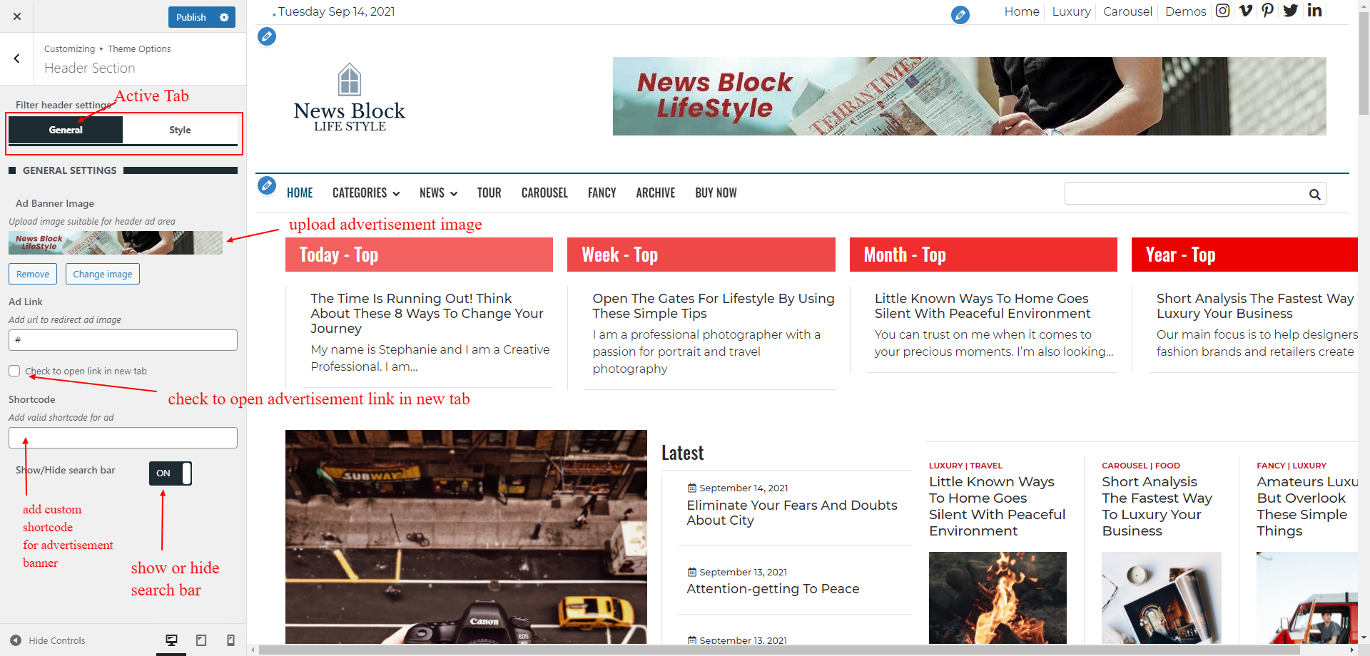
Go to Appearance > Customize > Theme Options > Header Section
General Settings
- Upload an image to display in header section as the adviretisement banner.
- Add advertisement url to navigate the given advertisement.
- Check to open advertisement link in new tab. Uncheck to open in same tab
- Enable/Disable button to show or hide search bar

To modify background color and text color of header section. Click on Style Tab in Header Section inside Theme Options Customizer Panel
Style Settings
- Choose the color to change the background color and text color of header, respectively from given fields

Layouts Settings
To customize the layouts of your site, frontpage, header, post, page, archive, search and 404 page .
Go to your Dashboard > Appearance > Customize > Theme Options > Layouts Settings
In Main Site Layout Section
- Choose the layout from given available image

In Header Layout Section
- Choose the layout from given available image
In Post Layout Section
- Choose the layout from given available image
In Page Layout Section
- Choose the layout from given available image
In Archive Layout Section
- Choose the layout from given available image
In Search Layout Section
- Choose the layout from given available image
In 404 Page Layout Section
- Choose the layout from given available image

Sidebar Layouts
Go to your Dashboard > Appearance > Customize > Theme Options > Sidebar Layouts
In Frontpage Sidebar Section
- Toggle on or off to show or hide sidebar
- Choose the layout from given available image
In Post Sidebar Section
- Toggle on or off to show or hide sidebar
- Choose the layout from given available image
In Page Sidebar Section
- Toggle on or off to show or hide sidebar
- Choose the layout from given available image
In Archive/Category Sidebar Section
- Toggle on or off to show or hide sidebar
- Choose the layout from given available image
In Search Sidebar Section
- Toggle on or off to show or hide sidebar
- Choose the layout from given available image
In 404 Page Sidebar Section
- Toggle on or off to show or hide sidebar
- Choose the layout from given available image

Footer Settings
Toggle the button at the top of Footer Section to show or hide section
General Settings
- Choose the footer column layout from given available layout images in Main Footer General Setting

To modify background image, background color and text color of footer section. Click on Style Tab in Footer Settings Section inside Theme Options Customizer Panel
- Upload an image to change the background of the footer section
- Choose the color to change the background color and text color of footer, respectively from given fields

General Settings
- Toggle the footer logo button to show or hide logo
- Upload the cutom logo for the bottom footer
- Toggle the footer menu button to show or hide footer menu ( To set top header menu please go to Appearance > Menus > Set menu location to the Bottom Footer)
- Toggle the footer social icons button to show or hide social icons
- Add or change the Site Info in the given textarea. you can add html tag here.

To modify background color and text color of bottom footer section. Click on Style Tab in Bottom Footer Settings Section inside Theme Options Customizer Panel
- Choose the color to change the background color and text color of bottom footer, respectively from given fields

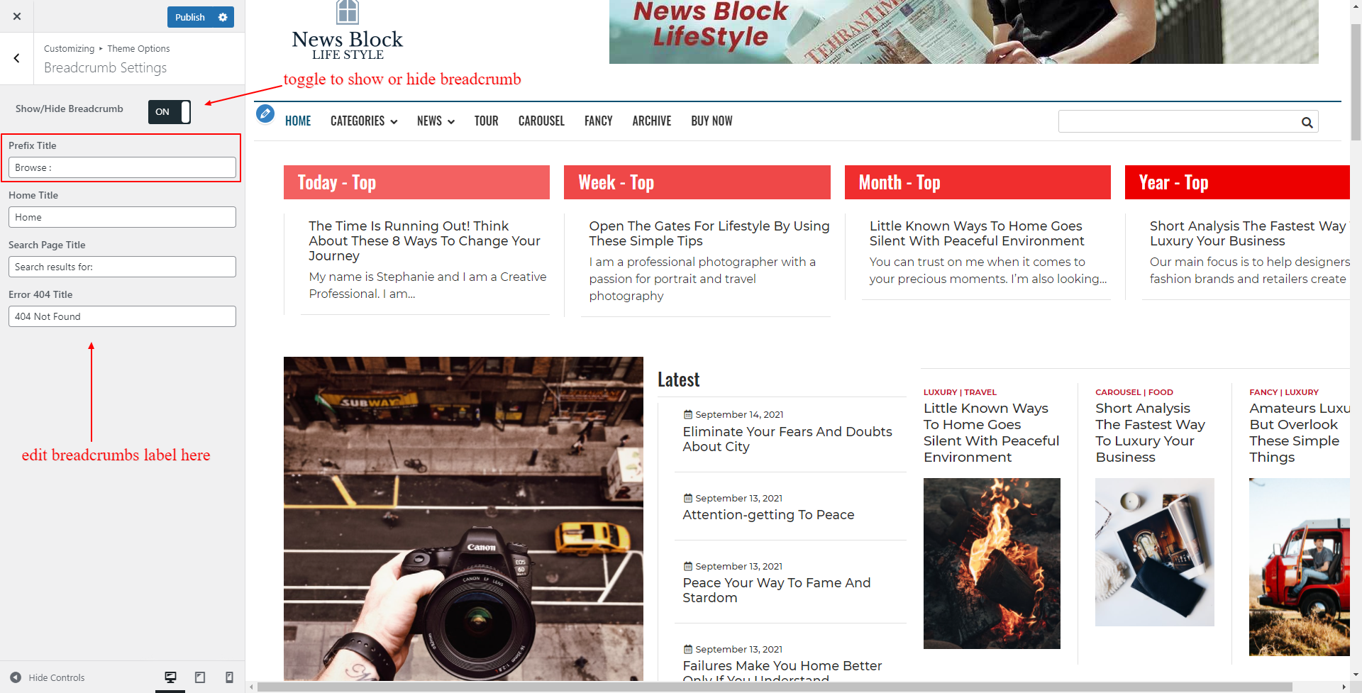
Breadcrumb Settings
Go To Dashboard > Appearance > Customize > Theme Options > Breadcrumb Settings
You can show or hide breadcrumb trail from the given toggle button at the top of Breadcrumb Setting
- Prefix title – Change the text in the text field that appeares at the beginning of breadcrumb
- Change the home title from text input field
- Change the search page title from text input field
- Change the Error 404 title from text input field

InnerPages Settings
Go to Dashboard > Appearance > Customize > Theme Options > InnerPages Setting

In Archive Page Section
To change the post layout of archive , category, tags and blog page.
- Choose the post layout from given radio image field
- In pagination type settings, Choose the type of pagination you want from dropdown options
- Select content/excerpt to show in archive page. Increase or decrease content word from given Word Count field
- Show/ Hide post date meta. change the date prefix from given text field
- Show/ Hide post author meta. change the author prefix from given text field
- Show/ Hide post categories meta. change the category prefix from given text field
- Show/ Hide post tags meta. change the tag prefix from given text field
- Show/ Hide read more button. change the read more label from given text field

In Single Page Section
- Show/ Hide post date meta. change the date prefix from given text field
- Show/ Hide post author meta. change the author prefix from given text field
- Show/ Hide post categories meta. change the category prefix from given text field
- Show/ Hide post tags meta. change the tag prefix from given text field

In Search Page Section
- Change the search title of your need in Search Title field
- Change the search not found content of your need in Search Content field
- In pagination type settings, Choose the type of pagination you want from dropdown options

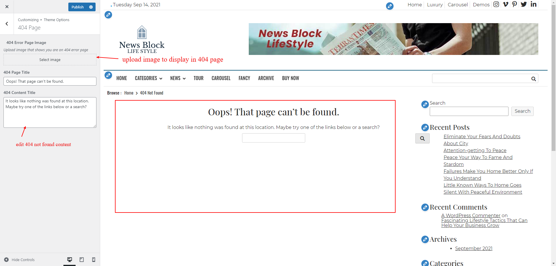
In 404 Page Section, Your content is replaced by the image. to show content remove image from the image field
- Upload the image you want to display in your 404 Not Found page
- Add 404 page title in 404 Page Title field
- Add 404 page content in 404 Page Content field

Typography Settings
Go to Dashboard > Appearance > Customize > Theme Options > Typography Section
You can change font family, font weight, font style, font size and line height of respective tag in this section.
Note: The changes in this settings are applied only for header, footer and inner pages. Gutenberg blocks and Elementor elements css is not inherited from this settings
To change the paragraph typography,
- Tap the P tab in the tab list
- To enqueue the changes you made toggle the button “ON”
- Choose the font family as your choice from the select dropdown options
- Select the dropdown option to change the font weight
- Select font style from the dropdown list
- Change the font size from the Font Size input fleld ( font size will be applied in px )
- Change the line height from the Line Height input fleld ( line height will be applied in px )
To change the heading one tag typography,
- Tap the H1 tab in the tab list
- To enqueue the changes you made toggle the button “ON”
- Choose the font family as your choice from the select dropdown options
- Select the dropdown option to change the font weight
- Select font style from the dropdown list
- Change the font size from the Font Size input fleld ( font size will be applied in px )
- Change the line height from the Line Height input fleld ( line height will be applied in px )
To change the heading two tag typography,
- Tap the H2 tab in the tab list
- To enqueue the changes you made toggle the button “ON”
- Choose the font family as your choice from the select dropdown options
- Select the dropdown option to change the font weight
- Select font style from the dropdown list
- Change the font size from the Font Size input fleld ( font size will be applied in px )
- Change the line height from the Line Height input fleld ( line height will be applied in px )
To change the heading three typography,
- Tap the H3 tab in the tab list
- To enqueue the changes you made toggle the button “ON”
- Choose the font family as your choice from the select dropdown options
- Select the dropdown option to change the font weight
- Select font style from the dropdown list
- Change the font size from the Font Size input fleld ( font size will be applied in px )
- Change the line height from the Line Height input fleld ( line height will be applied in px )


